Case study · University project · Mobile design
Redesigning Indonesia's mandatory COVID check-in app for foreign tourists, where a language barrier was keeping people out of public spaces.
During Indonesia's COVID response, Peduli Lindungi was a mandatory check-in app for entering malls, restaurants, offices, and public transport. The app was Indonesian-only. Vaccine verification could take up to three days to be approved. Security staff at the entrances were not trained to help users who did not speak Indonesian.
Field research in ten malls in July 2022 showed the same pattern at every entrance: a foreign tourist would arrive, fail to complete check-in on the app, and end up being processed manually on paper by a security guard. The redesign was for that tourist, not for the average user.
"The language barrier further complicated matters, with little assistance available from security personnel. These issues not only caused frustration but also restricted tourists' access to public spaces."
from field research notes, July 2022I did the field research across ten malls, ran a UX audit on the original app, interviewed tourists and security staff, then validated the redesign with a field test of ten participants. Open any method for the full detail.
Understanding the problem
Structuring the problem
Ideation and testing
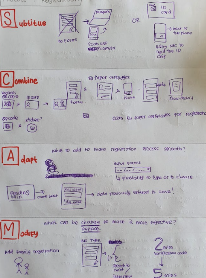
The obvious fix was localisation. Add English, done. But that would not solve the slow verification or the registration that delayed people for a day. I used SCAMPER to push past the obvious add-English fix and find structural improvements.
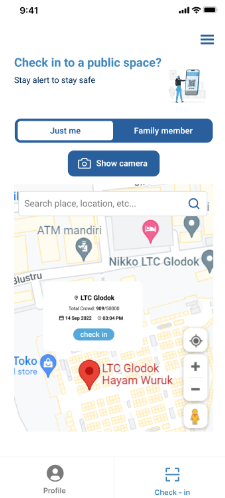
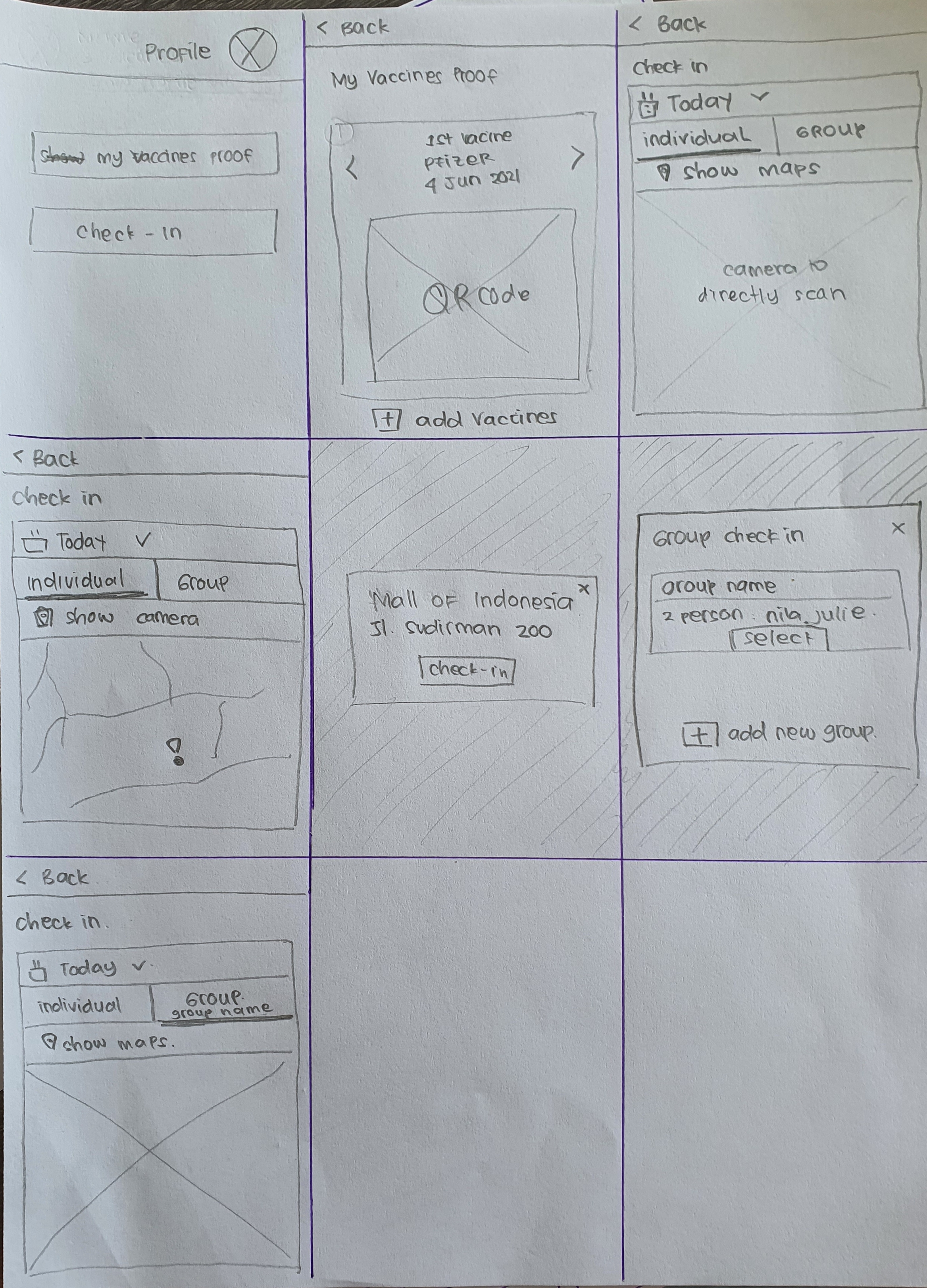
The home screen opens straight onto a map of nearby public spaces. A single toggle switches between checking in just yourself or your whole family, and the camera button stays on hand for venues that still rely on QR codes.
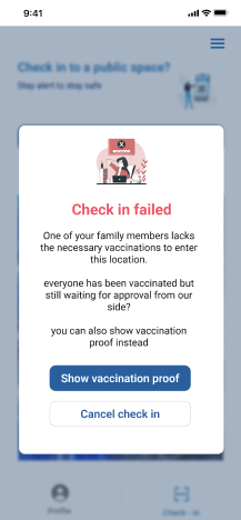
When a check-in is blocked, the screen says exactly why. A family member's vaccination is still awaiting approval, and the app offers a route forward: show vaccination proof instead, or cancel. No codes, no jargon, no dead end.
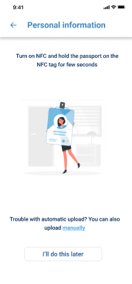
The original registration was a long set of fields in Indonesian, where tourists gave up or made small errors that delayed verification by another day. Now they hold their passport to the back of the phone, the chip is read in a few seconds, and the form is populated. If the NFC read fails, manual upload is available; if both fail, the step can be skipped and finished later.
Average check-in time dropped from 10 to 20 seconds down to around 5 seconds in the field test. Pre-check-in was the largest contributor. We made verification a one-time cost rather than a per-venue cost: once a tourist had their certificate approved, the proof was stored in the app and reused, so every subsequent check-in at any venue was near-instant. Satisfaction moved from 5.6 to 8.5 out of 10 on the same participant group, and field test data showed the manual paper-and-pen queue at mall entrances became shorter once foreign tourists could complete check-in independently. The most consistent feedback was on the recovery flows from failed check-ins.
During Indonesia's COVID response, Peduli Lindungi was a mandatory check-in app for entering malls, restaurants, offices, and public transport. The app was Indonesian-only. Vaccine verification could take up to three days to be approved. Security staff at the entrances were not trained to help users who did not speak Indonesian.
Field research in ten malls in July 2022 showed the same pattern at every entrance: a foreign tourist would arrive, fail to complete check-in on the app, and end up being processed manually on paper by a security guard. The redesign was for that tourist, not for the average user.
"The language barrier further complicated matters, with little assistance available from security personnel. These issues not only caused frustration but also restricted tourists' access to public spaces."
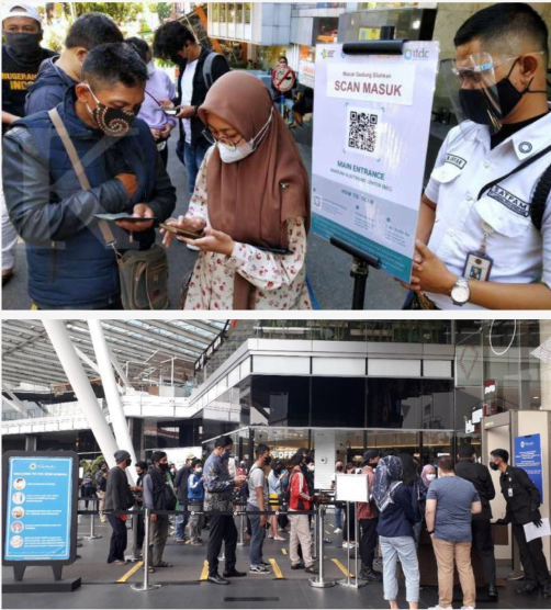
from field research notes, July 2022The same pattern repeated at every mall. A foreign tourist would arrive at the entrance, attempt the check-in on Peduli Lindungi, fail, and end up in a manual queue where a security guard would process them with pen and paper.
The failure mode was not identical across sites: sometimes the app failed to load, sometimes the vaccine verification was not yet approved, sometimes the user could not read the Indonesian-only interface. The outcome was the same: the digital flow ended in a paper queue.
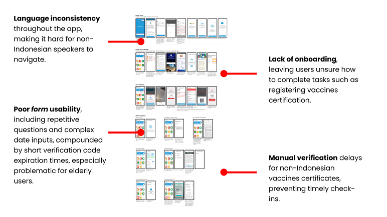
After the field research, I did a UX audit of the original Peduli Lindungi app, scoring each screen against Nielsen's ten heuristics.
The audit produced 23 heuristic violations across the check-in flow alone.
The most consequential ones, ranked by how often they showed up in the field failures, were: no support for non-Indonesian users (language, terminology, regional assumptions), status messages that did not say what to do next ("check-in failed" with no recovery path), long forms with no progress indicator and no save-and-continue, and inconsistent feedback states between the QR scanner and the manual entry path.
After the audit, I interviewed two groups: foreign tourists who had failed check-ins and security staff at the mall entrances.
The most useful piece came from the security staff. They had developed an unofficial paper protocol for processing failed digital check-ins: photograph the passport, manually write down the vaccine certificate numbers, call a supervisor for verification. The whole process took five to ten minutes per tourist and was the single biggest source of delays at mall entrances.
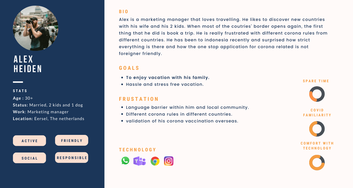
From those interviews I built a persona and mapped the full journey, from downloading the app to checking in at a venue. I focused on the edge cases, not the happy path: check-in rejection, a family member needing separate registration, a certificate not yet approved. Those moments caused the most frustration, and they were also the most common.
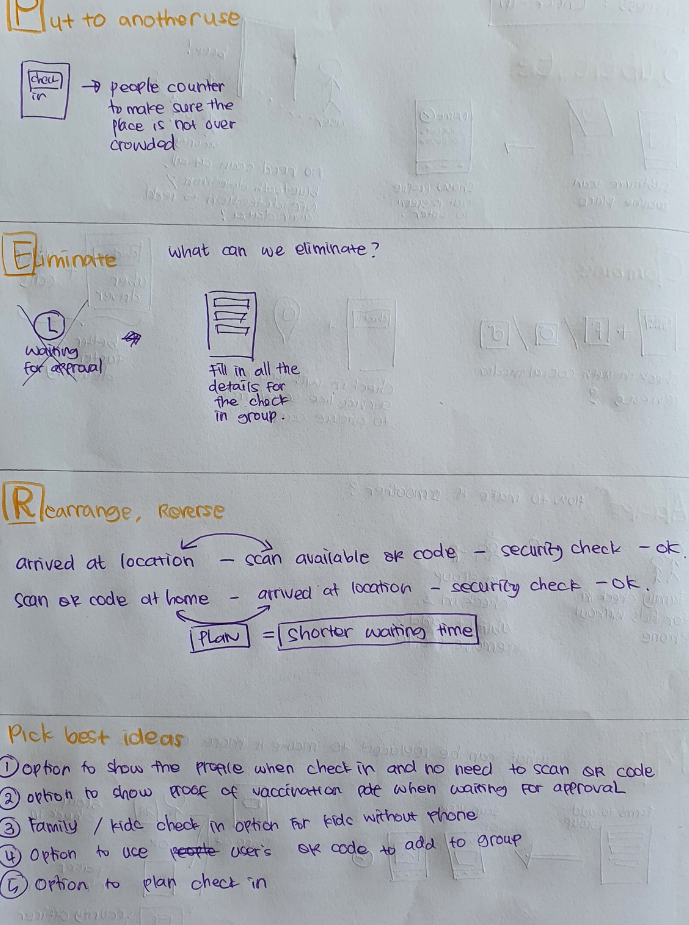
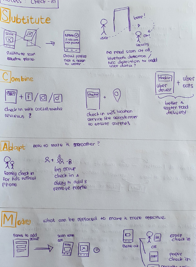
I used SCAMPER to push past the obvious "just add English" fix, because that would not have addressed the verification delay, the manual fallback queue, or the missing recovery paths.
Three SCAMPER prompts produced the core design decisions. Combine: combine vaccine verification with check-in into a single one-time approval, the pre-check-in feature. Eliminate: eliminate the Indonesian-language registration form by reading the passport directly via NFC. Reverse: reverse the failure pattern, so the app tells the user what specifically went wrong and how to fix it instead of "check-in failed".
The ideas that made it into the prototype:
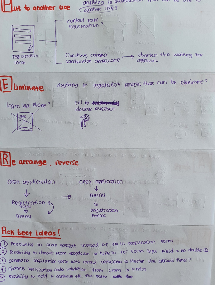
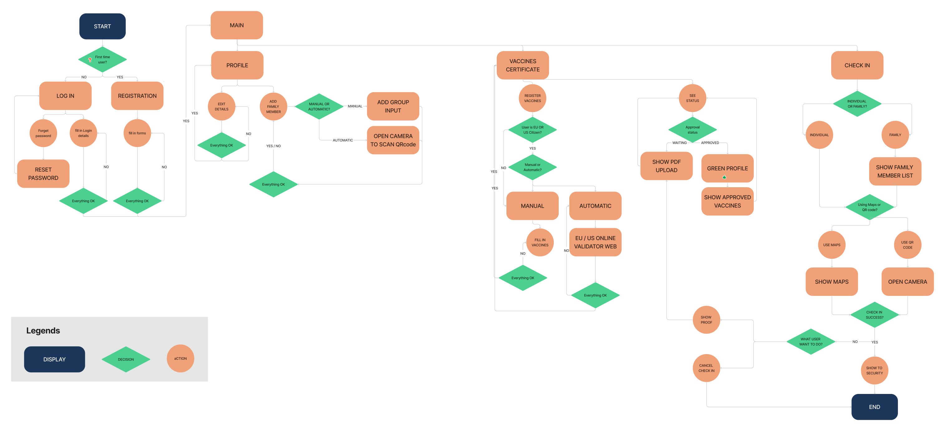
Before any wireframes, I mapped the full flow from download to check-in, with every branching path: vaccine not yet approved, check-in rejected, family member not registered. The failure paths were where tourists got most stuck, so I wanted to design for them up front rather than find them late.
The map also let me check that pre-check-in and geofencing added no steps to the core flow. They had to run in the background for anyone who already had an approved certificate.
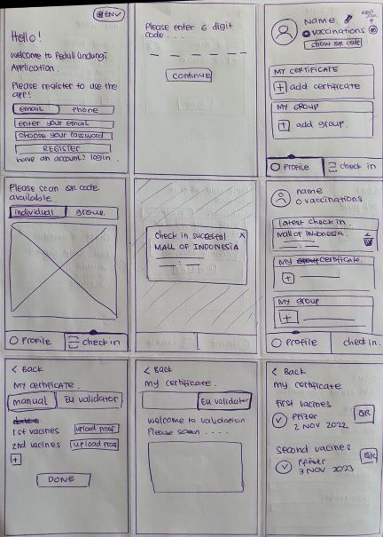
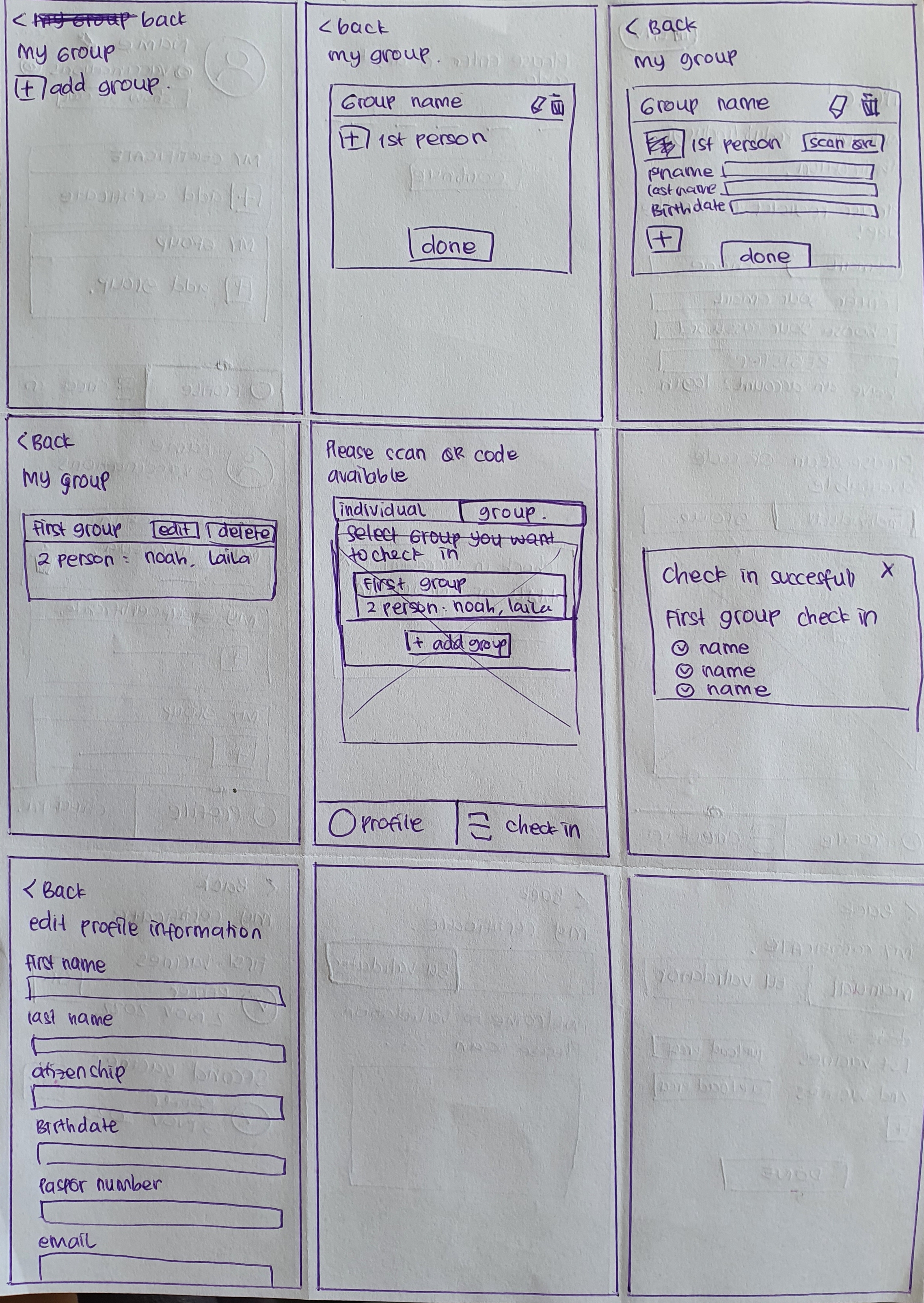
I started with low-fidelity wireframes from the user flow and tested them with a few people to check layout and navigation logic before building anything high-fidelity. A navigation issue caught at sketch stage takes about five minutes to fix. At hi-fi stage it takes much longer.
The prototype was a Figma design covering the redesigned flows: registration with NFC, pre-check-in with reusable vaccine proof, the main check-in screen with venue map, and the redesigned failure-state modals. I built one click-through prototype.
The colour palette was more neutral than the original Peduli Lindungi one, because the field research showed the strong government look was confusing to tourists who did not recognise the visual cues.
The home screen opens straight onto a map of nearby public spaces. A single toggle switches between checking in just yourself or your whole family, and the camera button stays on hand for venues that still rely on QR codes.
When a check-in is blocked, the screen says exactly why. A family member's vaccination is still awaiting approval, and the app offers a route forward: show vaccination proof instead, or cancel. No codes, no jargon, no dead end.
The original registration was a long set of fields in Indonesian, where tourists gave up or made small errors that delayed verification by another day. Now they hold their passport to the back of the phone, the chip is read in a few seconds, and the form is populated. If the NFC read fails, manual upload is available; if both fail, the step can be skipped and finished later.
I set up in a public area near a mall and asked 10 participants to complete a check-in flow while standing, holding a bag, and reading at walking pace, timed. The redesigned flow took around 5 seconds on average, compared to 10 to 20 seconds for the original, and satisfaction moved from 5.6 to 8.5 on a 10-point scale.
The most consistent feedback was on the recovery flows: participants described the new failure modals as "actually telling me what to do next", a phrase that came up four times across ten participants.
Average check-in time dropped from 10 to 20 seconds down to around 5 seconds in the field test. Pre-check-in was the largest contributor. We made verification a one-time cost rather than a per-venue cost: once a tourist had their certificate approved, the proof was stored in the app and reused, so every subsequent check-in at any venue was near-instant. Satisfaction moved from 5.6 to 8.5 out of 10 on the same participant group, and field test data showed the manual paper-and-pen queue at mall entrances became shorter once foreign tourists could complete check-in independently. The most consistent feedback was on the recovery flows from failed check-ins.
What shifted most for me was how I think about language in design. Before this, I saw English support as a feature you add for international users. After a month watching tourists get blocked by an app they could not read, I saw it differently. Language is access. When an app is mandatory for entry, a language barrier is not an inconvenience. It blocks daily life.
A government context also forced some humility. The original app was not bad because the engineers did not care. It was built under crisis conditions, with competing pressures, in a short timeframe. That does not excuse the usability problems, but it changes how you approach the redesign. You are not just improving an interface. You are working inside a system that exists for reasons beyond UX.
The limitation I would fix on a second pass: only 10 field-test participants, none elderly or with diagnosed accessibility needs. A stronger test would include those users, since they faced the highest barriers in the original app.
The same pattern repeated at every mall. A foreign tourist would arrive at the entrance, attempt the check-in on Peduli Lindungi, fail, and end up in a manual queue where a security guard would process them with pen and paper.
The failure mode was not identical across sites: sometimes the app failed to load, sometimes the vaccine verification was not yet approved, sometimes the user could not read the Indonesian-only interface. The outcome was the same: the digital flow ended in a paper queue.
After the field research, I did a UX audit of the original Peduli Lindungi app, scoring each screen against Nielsen's ten heuristics. The audit produced 23 heuristic violations across the check-in flow alone.
The most consequential ones, ranked by how often they showed up in the field failures, were: no support for non-Indonesian users (language, terminology, regional assumptions), status messages that did not say what to do next ("check-in failed" with no recovery path), long forms with no progress indicator and no save-and-continue, and inconsistent feedback states between the QR scanner and the manual entry path.
After the audit, I interviewed two groups: foreign tourists who had failed check-ins and security staff at the mall entrances.
The most useful piece came from the security staff. They had developed an unofficial paper protocol for processing failed digital check-ins: photograph the passport, manually write down the vaccine certificate numbers, call a supervisor for verification. The whole process took five to ten minutes per tourist and was the single biggest source of delays at mall entrances.
From those interviews I built a persona and mapped the full journey, from downloading the app to checking in at a venue. I focused on the edge cases, not the happy path: check-in rejection, family members needing separate registration, a certificate not yet approved. Those moments caused the most frustration, and they were also the most common.
Before any wireframes, I mapped the full flow from download to check-in, with every branching path: vaccine not yet approved, check-in rejected, family member not registered. The failure paths were where tourists got most stuck, so I wanted to design for them up front rather than find them late.
The map also let me check that pre-check-in and geofencing added no steps to the core flow. They had to run in the background for anyone who already had an approved certificate.
I used SCAMPER to push past the obvious "just add English" fix, because that would not have addressed the verification delay, the manual fallback queue, or the missing recovery paths.
Three SCAMPER prompts produced the core design decisions. Combine: combine vaccine verification with check-in into a single one-time approval, the pre-check-in feature. Eliminate: eliminate the Indonesian-language registration form by reading the passport directly via NFC. Reverse: reverse the failure pattern, so the app tells the user what specifically went wrong and how to fix it instead of "check-in failed".
The ideas that made it into the prototype:
I set up in a public area near a mall and asked 10 participants to complete a check-in flow while standing, holding a bag, and reading at walking pace, timed. The redesigned flow took around 5 seconds on average, compared to 10 to 20 seconds for the original, and satisfaction moved from 5.6 to 8.5 on a 10-point scale.
The most consistent feedback was on the recovery flows: participants described the new failure modals as "actually telling me what to do next", a phrase that came up four times across ten participants.
I started with low-fidelity wireframes and tested them with a few people to check layout and navigation logic before building anything high-fidelity. A navigation issue caught at sketch stage takes about five minutes to fix. At hi-fi stage it takes much longer.