Case study · Fontys Lectoraat · Stress coaching
A stress-tracking app for people with ASD that pairs Moodmetric ring data with the user's own journal entries.
The Moodmetric ring measures physical arousal, which is not the same as stress. Without input from the user, the ring data alone cannot tell you the cause.
The Fontys Lectoraat's stress-coaching project needed an app that paired ring data with journal entries from the user. The data side was the easier part of the project.
The harder part was the audience: people with Autism Spectrum Disorder, who often prefer simple tasks, work at their own pace, and can be triggered by unexpected interactions including push notifications.
Design goal: Build a simple, clear interface that helps users gain insight into their stress patterns through a combination of wearable data and their own journal entries, without overwhelming them in the process.
I worked through the problem in three phases, grounded in understanding the user, structuring the functionality, and testing with the target audience before locking the design. Open any method for the full detail.
Understanding the user
Structuring the problem
Testing with the target audience
Three deliberate design choices defined the product:
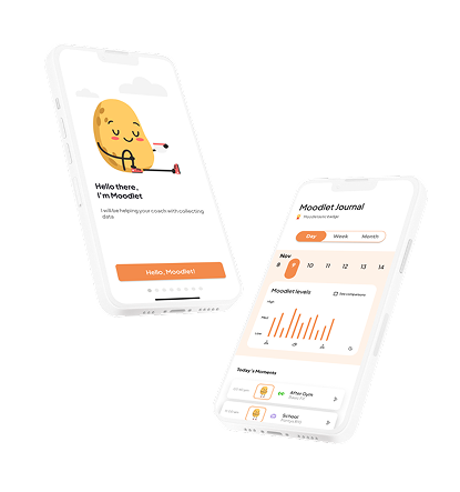
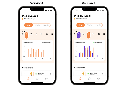
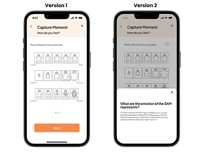
The result is a high-fidelity prototype that pairs Moodmetric ring data with the user's own journal entries to help people with ASD understand their stress. The full functionality fits inside three clear pages, home, journal, and settings, which matched what this audience could handle without feeling overwhelmed. Three interviews with participants from the target group were the recruitment limit for this project, not the original target, and the findings were sharp enough to act on. Two changes shipped straight from testing: a comparison chart for stacking days against each other, added after users wanted week-over-week patterns, and a simplified SAM (Self-Assessment Manikin), where the original labels were causing more confusion than they helped.
For most apps a notification is a default tool. For this audience it can trigger the stress response the app is trying to help with. We treated every push notification as a design risk rather than a feature and removed most of them. The few that stayed are user-configurable from the first onboarding screen, not buried in settings.
Three participants from the target group was the realistic limit for a project of this size, and the findings were sharp enough to act on. A follow-up study would need access to a clinical network, not an open call.
The Moodmetric ring measures physical arousal, which is not the same as stress. Without input from the user, the ring data alone cannot tell you the cause.
The Fontys Lectoraat's stress-coaching project needed an app that paired ring data with journal entries from the user. The data side was the easier part of the project.
The harder part was the audience: people with Autism Spectrum Disorder, who often prefer simple tasks, work at their own pace, and can be triggered by unexpected interactions including push notifications.
Design goal: Build a simple, clear interface that helps users gain insight into their stress patterns through a combination of wearable data and their own journal entries, without overwhelming them in the process.
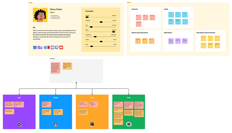
The persona was Daan, a 27-year-old graphic designer with ASD, working part-time and learning to manage workplace stress without burnout. His main problem was that he could feel his stress rising during the day but could not always identify what was causing it until he was already overwhelmed.
The empathy map was more useful than the persona alone. The design decisions depended on what Daan was thinking, feeling, doing, and saying at specific moments in the day, and the empathy map gave that texture: the morning check-in moment, the mid-task arousal spike, and the post-meeting recovery period.
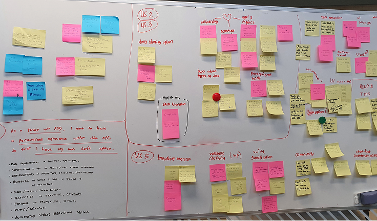
User stories framed what users need from the app. As a person with ASD, I want to: know the causes of my stress, know what data is collected and how it is stored, have a simple data view so I don't feel overwhelmed, and have a personalised experience.
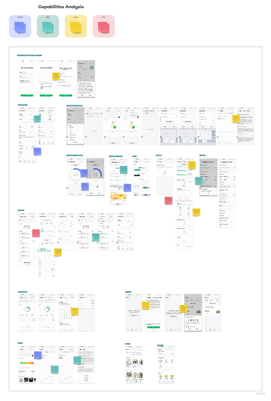
We collected the good, best, and common practices of direct and indirect competitors. Direct competitors are apps that measure stress levels, such as Samsung Health and Apple Health. Indirect competitors are activity trackers, such as Productive.
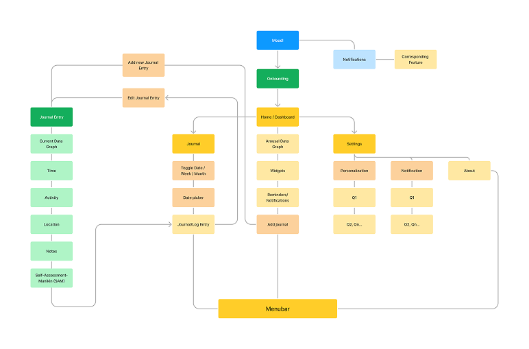
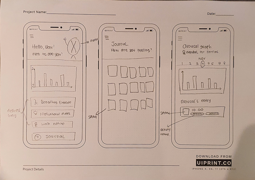
The functions were organised into three pages: the home page, with the arousal graph and actions to help users relax; the journal page, where users view the graph and journal entries for a chosen date; and the settings page, where users adjust app settings.
The strict three-page limit was the audience constraint. Navigation complexity is one of the strongest stress triggers for users with ASD, and three pages, each with one clear purpose, kept the cognitive load low. Features that would normally get their own page, like data analysis, trend views, and weekly summaries, lived as panels inside the three core pages.
Discussing the sketches with colleagues allowed us to identify potential issues or challenges early in the process.
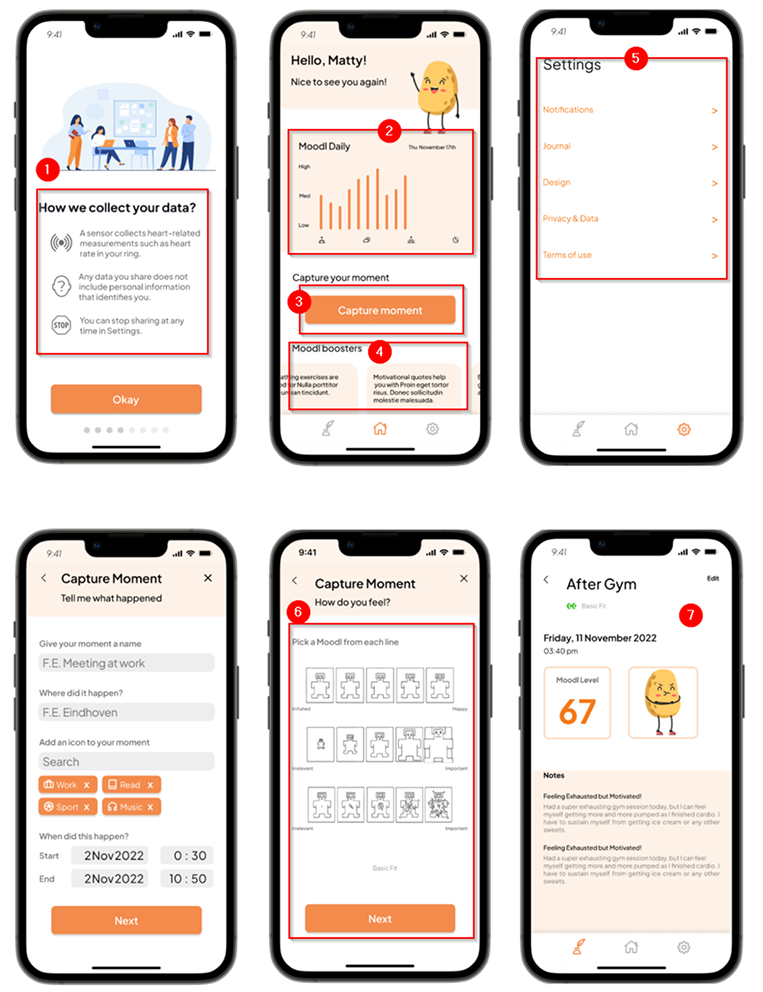
The high-fidelity prototype turned the architecture and sketches into a testable flow. Key decisions:
The interface includes deliberate friction in a few places, because this audience benefits from interface rhythms that match their thinking pace. Capture Moment has a confirmation step, settings changes have an undo, and journal entries need a two-step confirmation to delete. Push notifications were treated as a risk rather than a feature: most were removed, and the few that stayed are user-configurable from the first onboarding screen.
We ran three interviews with participants from the target group, people with ASD, and asked them to perform tasks in the app. Three was the recruitment limit for this project, not the original target, and the insights were sharp enough to act on.
Two changes shipped before the prototype was final:
For most apps a notification is a default tool. For this audience it can trigger the stress response the app is trying to help with. We treated every push notification as a design risk rather than a feature and removed most of them. The few that stayed are user-configurable from the first onboarding screen, not buried in settings.
Three participants from the target group was the realistic limit for a project of this size, and the findings were sharp enough to act on. A follow-up study would need access to a clinical network, not an open call.
The persona was Daan, a 27-year-old graphic designer with ASD, working part-time and learning to manage workplace stress without burnout. His main problem was that he could feel his stress rising during the day but could not always identify what was causing it until he was already overwhelmed.
The empathy map was more useful than the persona alone. The design decisions depended on what Daan was thinking, feeling, doing, and saying at specific moments in the day, and the empathy map gave that texture: the morning check-in moment, the mid-task arousal spike, and the post-meeting recovery period.
We collected the good, best, and common practices of direct and indirect competitors. Direct competitors are apps that measure stress levels, such as Samsung Health and Apple Health. Indirect competitors are activity trackers, such as Productive.
User stories framed what users need from the app. As a person with ASD, I want to: know the causes of my stress, know what data is collected and how it is stored, have a simple data view so I don't feel overwhelmed, and have a personalised experience.
The functions were organised into three pages: the home page, with the arousal graph and actions to help users relax; the journal page, where users view the graph and journal entries for a chosen date; and the settings page, where users adjust app settings.
The strict three-page limit was the audience constraint. Navigation complexity is one of the strongest stress triggers for users with ASD, and three pages, each with one clear purpose, kept the cognitive load low. Features that would normally get their own page, like data analysis, trend views, and weekly summaries, lived as panels inside the three core pages.
We ran three interviews with participants from the target group, people with ASD, and asked them to perform tasks in the app. Three was the recruitment limit for this project, not the original target, and the insights were sharp enough to act on.
Two changes shipped before the prototype was final: