Case study · Student project · Mobile app
A grocery comparison app for newly arrived expats in the Netherlands, designed to find familiar products, compare prices, and shop in Dutch supermarkets without the friction.
Six grocery comparison apps already existed in the Netherlands when this project started. All of them were Dutch-only, browser-based, and missing the features users kept asking for in interviews:
The market gap was not technical. No one had designed for this user yet.
"Most participants were already looking up prices on store websites before leaving the house. It worked, but it was slow and spread across four or five different sites."
from interview notesI worked from real expat behaviour, through a market and problem definition, into testing before and after launch. Open any method for the full detail.
Understanding the user
Structuring the problem
Testing the solution
Each core screen went through several rounds of usability testing and iteration. A few of the changes that came out of those rounds:
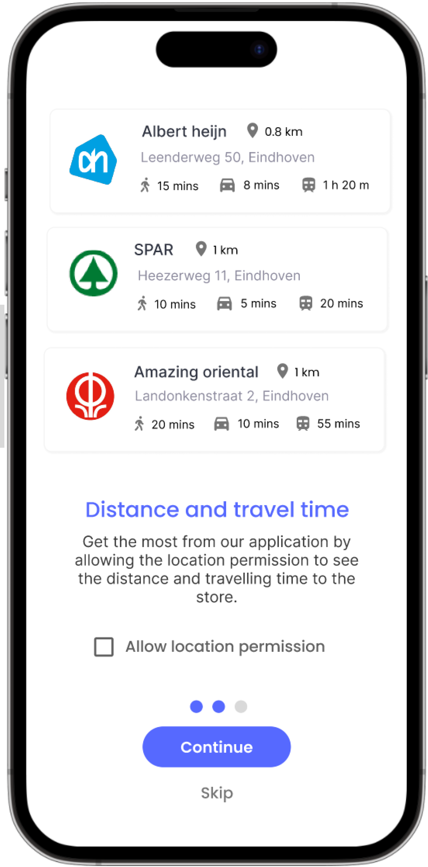
The onboarding leads with a clearer image of what the app is for, and the copy was rewritten around what users gain, the distance and travel time to nearby stores, instead of the technical permission it asks for.
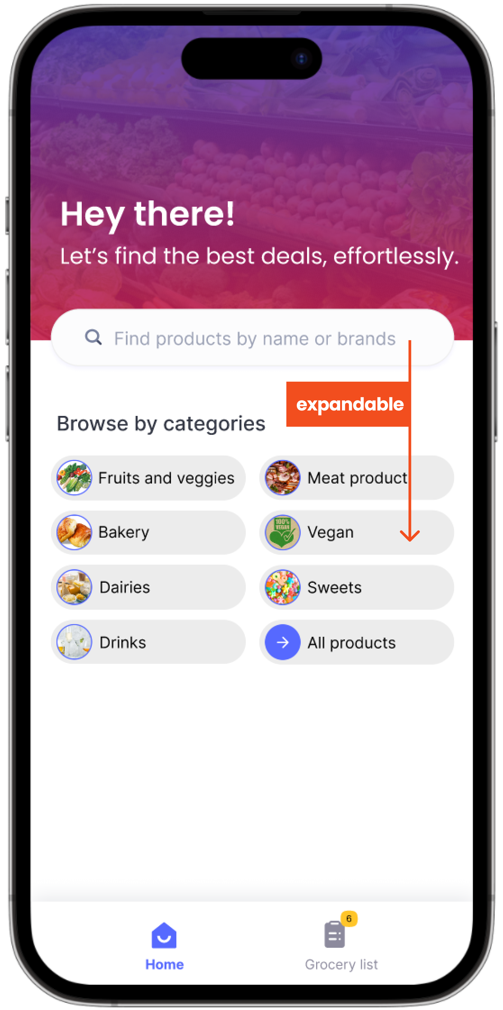
The intro copy was chosen from a preference test, and the search bar grew into a larger, expandable header that sits within thumb reach. Category buttons were enlarged and the navigation icons gained clear text labels.
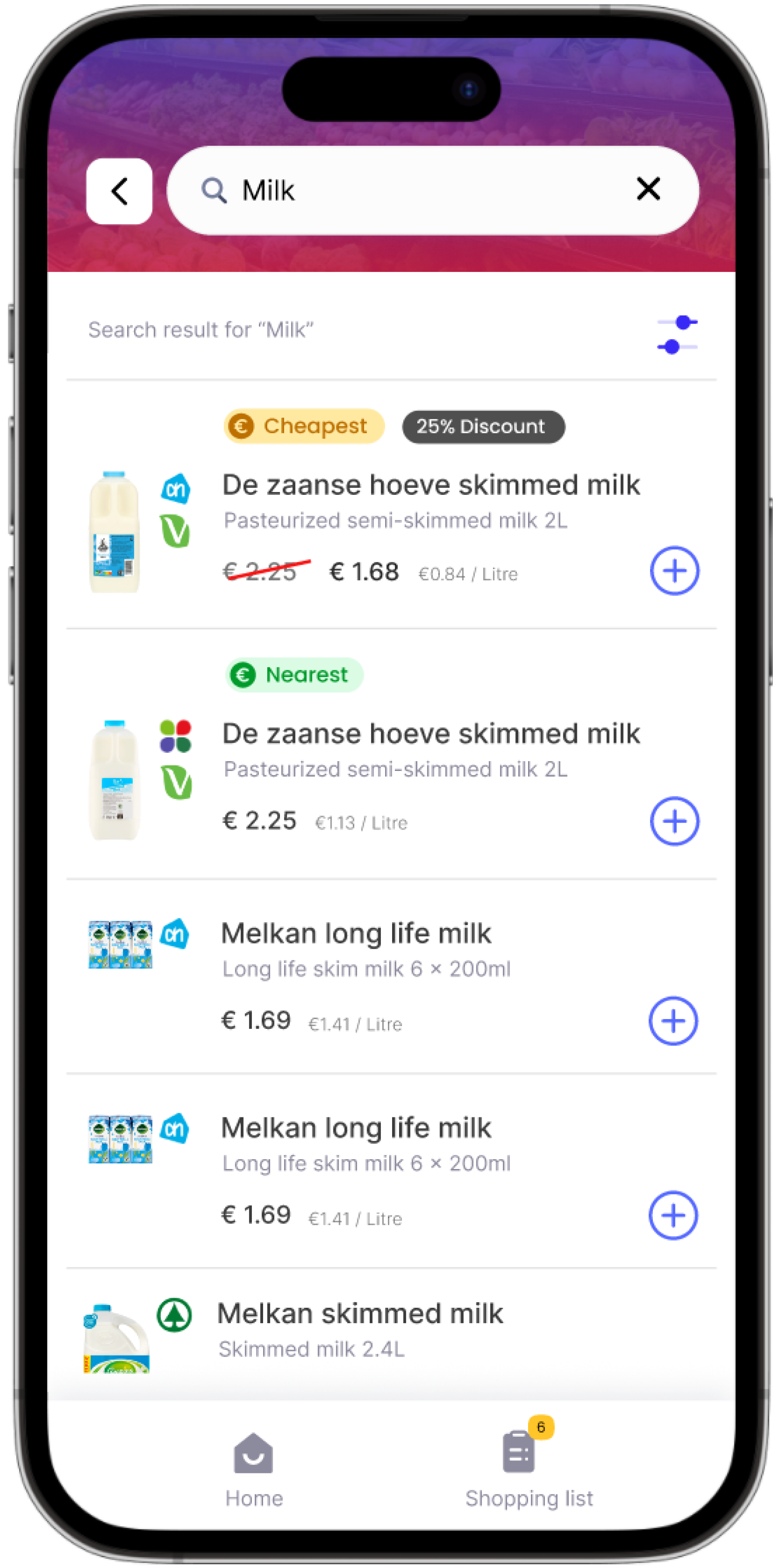
Results moved the search bar clear of the camera island, sharpened the product text, and emphasised the Cheapest and Nearest tags that set the app apart. The add-to-list button was enlarged and simplified after an expert review mistook the old one for a paste button.
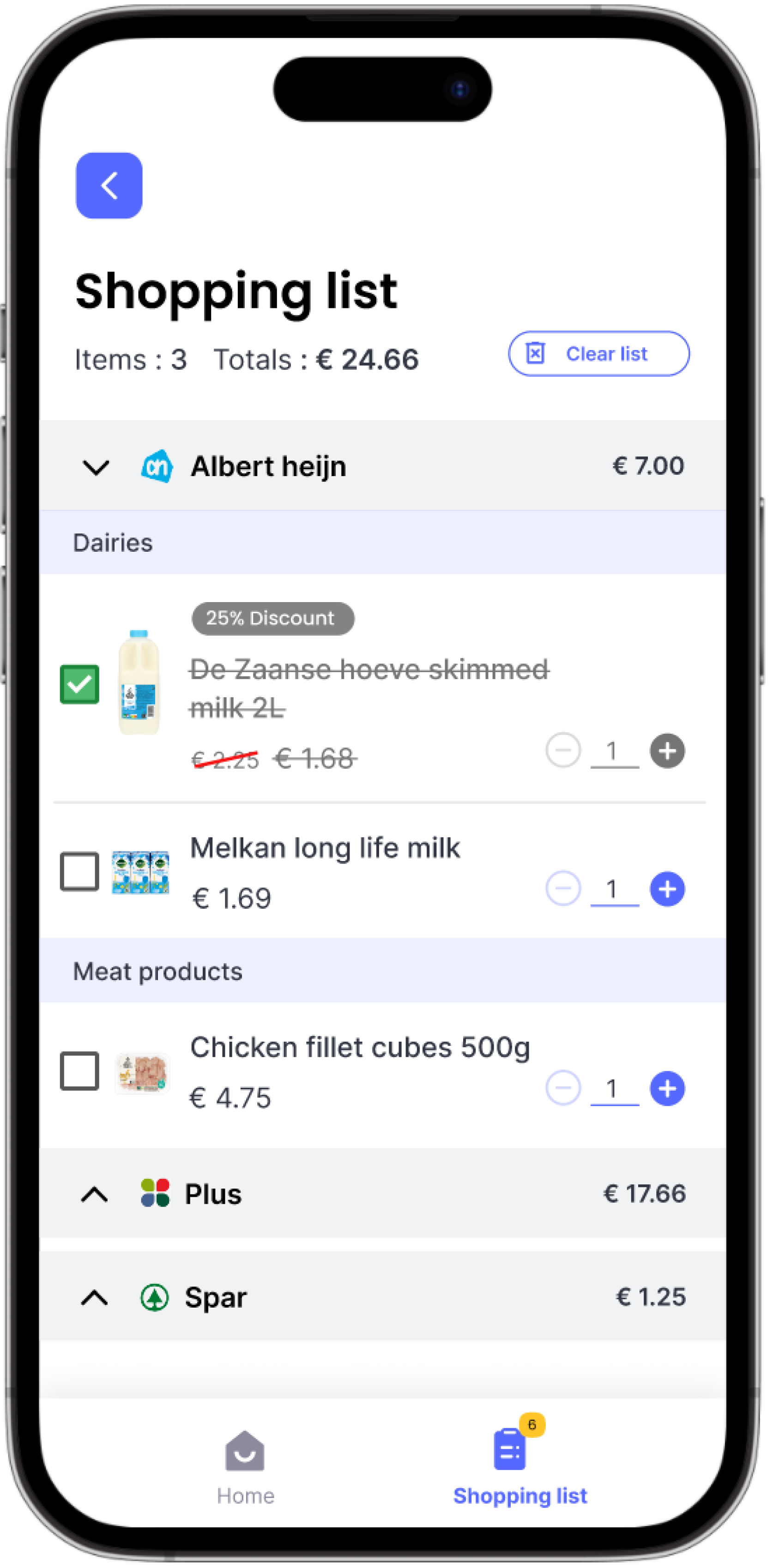
Items are grouped by store and aisle category, so everything in one section can be grabbed at once, with collapsible groups for long lists. The intimidating delete button became a plainer clear list.
The existing apps were not just incomplete. They were designed for a completely different user. Filling the gap well meant understanding why those gaps existed in the first place, then designing directly for the person no one had built for.
Six grocery comparison apps already existed in the Netherlands when this project started. All of them were Dutch-only, browser-based, and missing the features users kept asking for in interviews:
The market gap was not technical. No one had designed for this user yet.
"Most participants were already looking up prices on store websites before leaving the house. It worked, but it was slow and spread across four or five different sites."
from interview notesI did ten interviews with newly arrived expats in the Netherlands. The market gap was easy to describe but hard to specify, so the interviews were meant to turn it into a list of features people would actually use, ranked by importance.
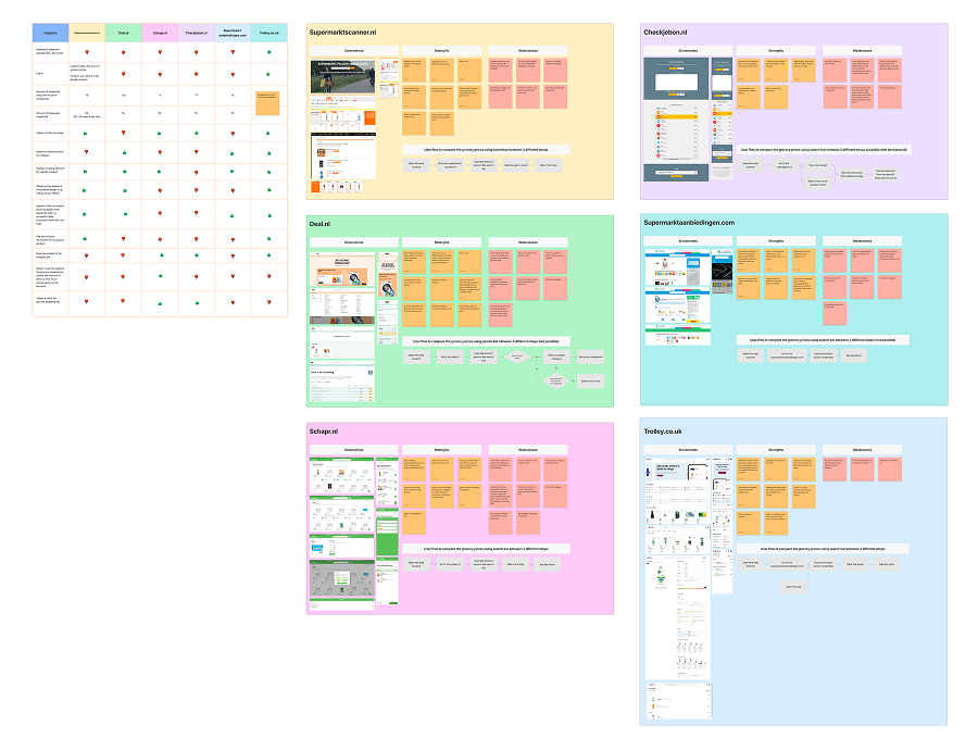
Six grocery comparison apps existed in the Netherlands at the time of the project. The market gap was specific: English support was completely absent across all six, and only one had any mobile experience worth calling that.
The MVP scope followed directly from this. Anything an existing app did well was treated as a baseline, and anything no existing app did was a candidate for the MVP. The five features chosen for the MVP were the five that none of the existing apps covered well.
Before drawing any screens, I mapped the full navigation structure in a UX flow chart. The app had to be simple enough for a first-time user to move through without instruction, especially someone unfamiliar with Dutch app conventions. That is harder to design for than it sounds across multiple languages and user contexts.

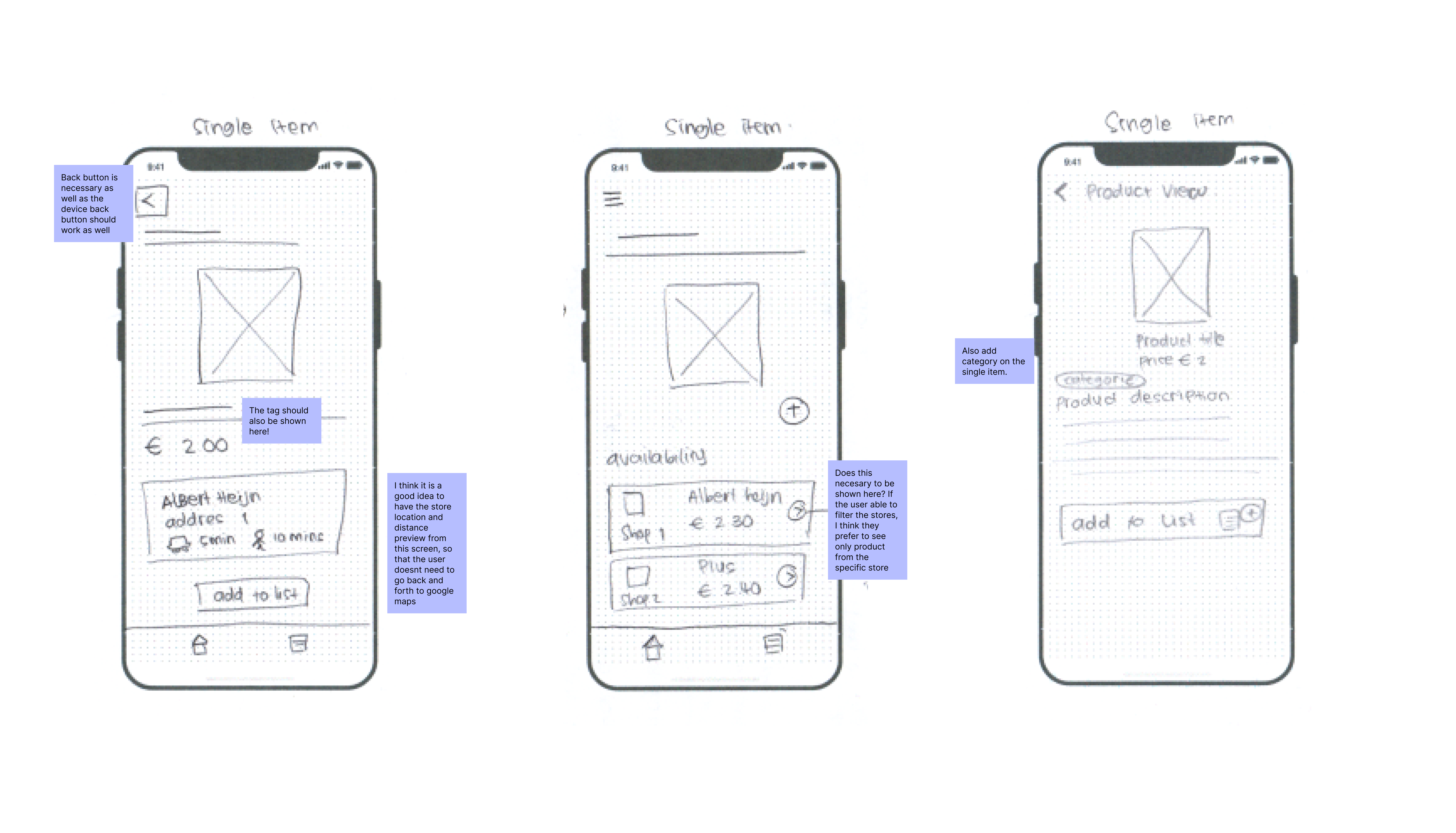
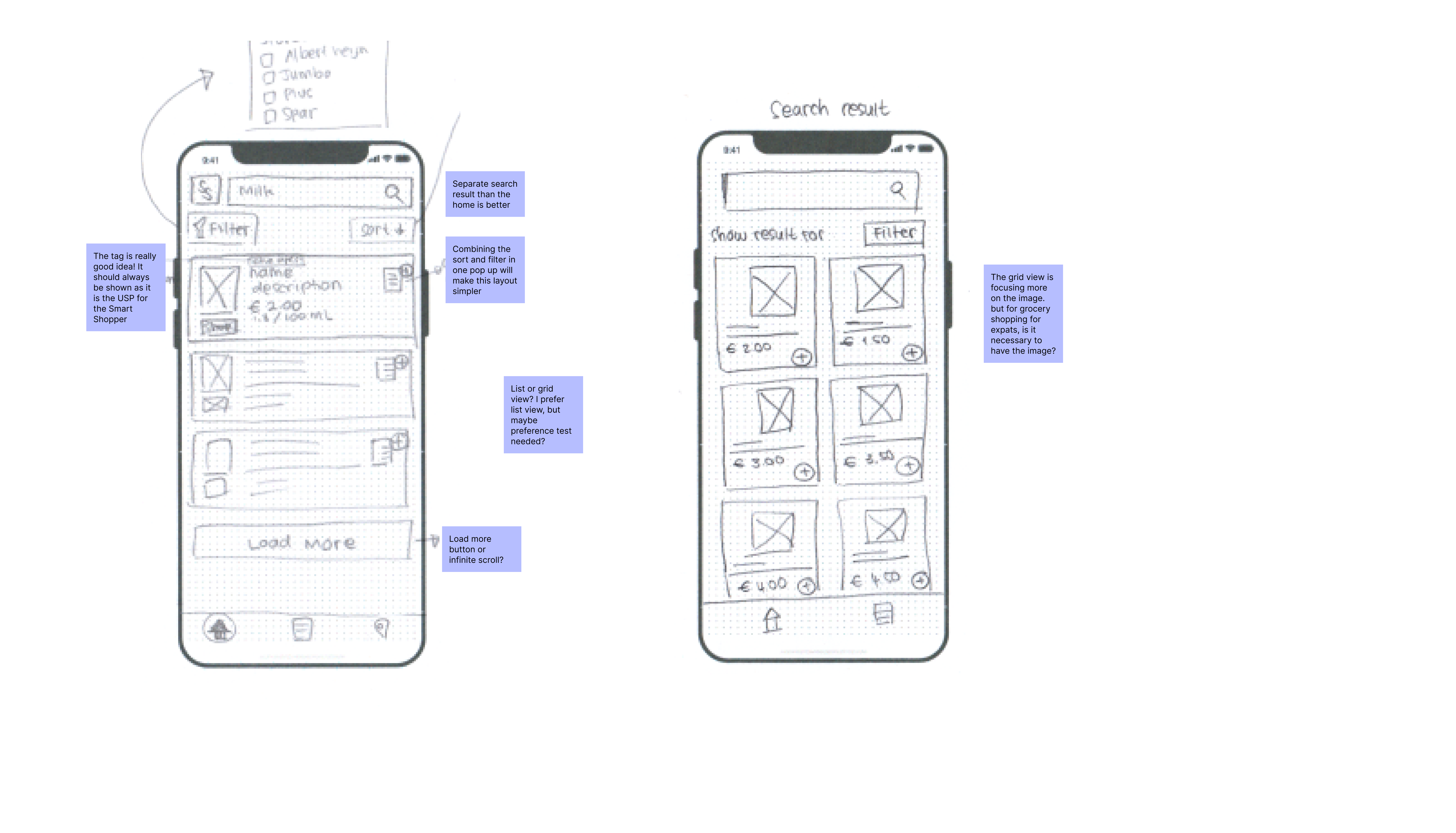
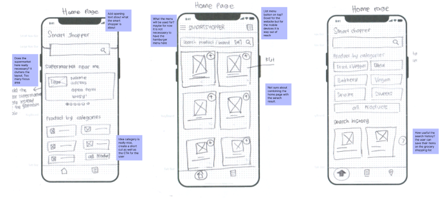
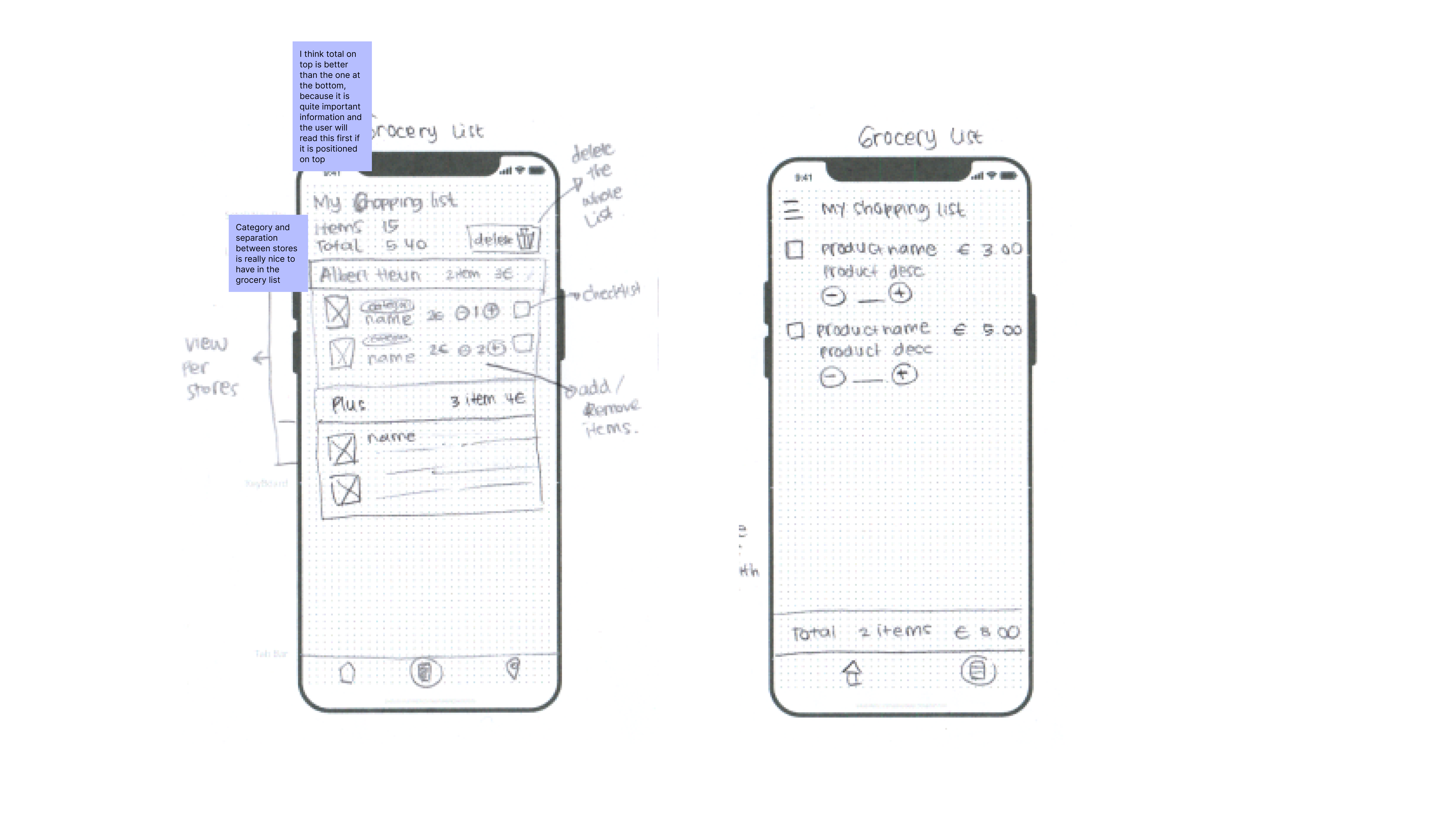
The sketching phase was four iterations. The reason for staying low-fidelity that long was that the screens would depend on the data structure of the Shopping Scraper API, which the back-end developer was still building, and committing to high-fidelity too early would have wasted work.
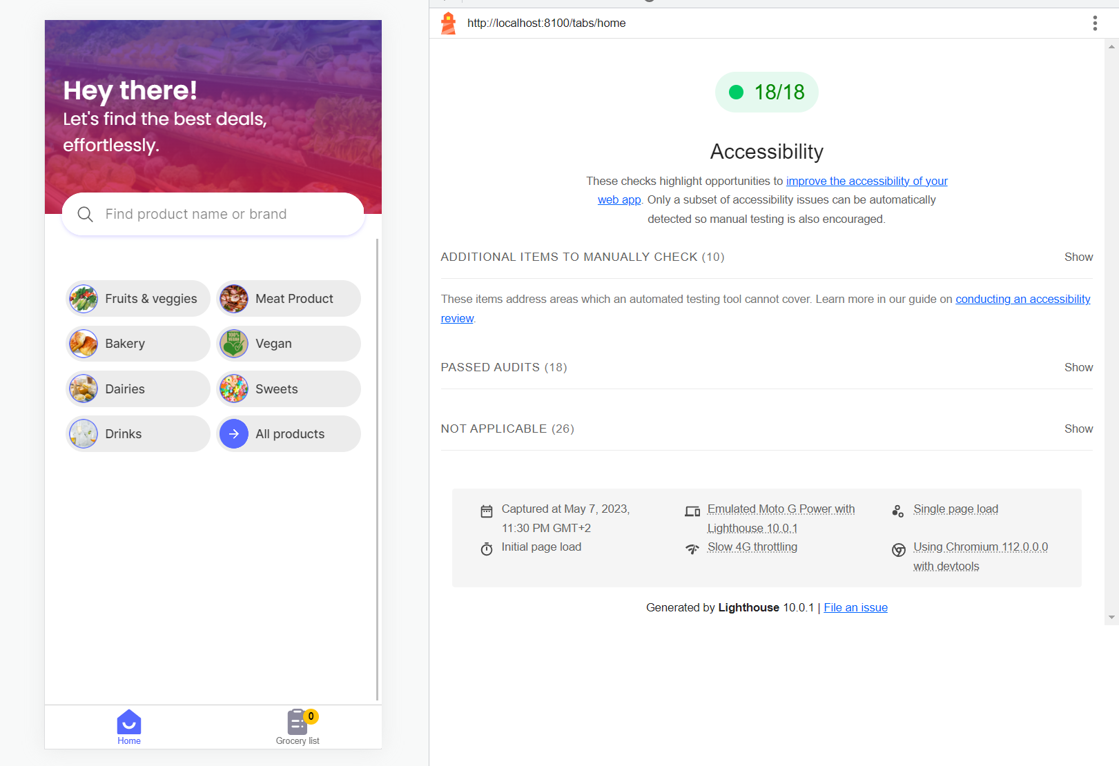
When the API structure stabilised, I moved to high-fidelity in Figma across three core flows: onboarding, search-to-list, and the shopping list view. The design system was small, twelve components built from scratch for this project, and biased toward accessibility from the start because the WCAG-AA requirement was a fixed constraint.
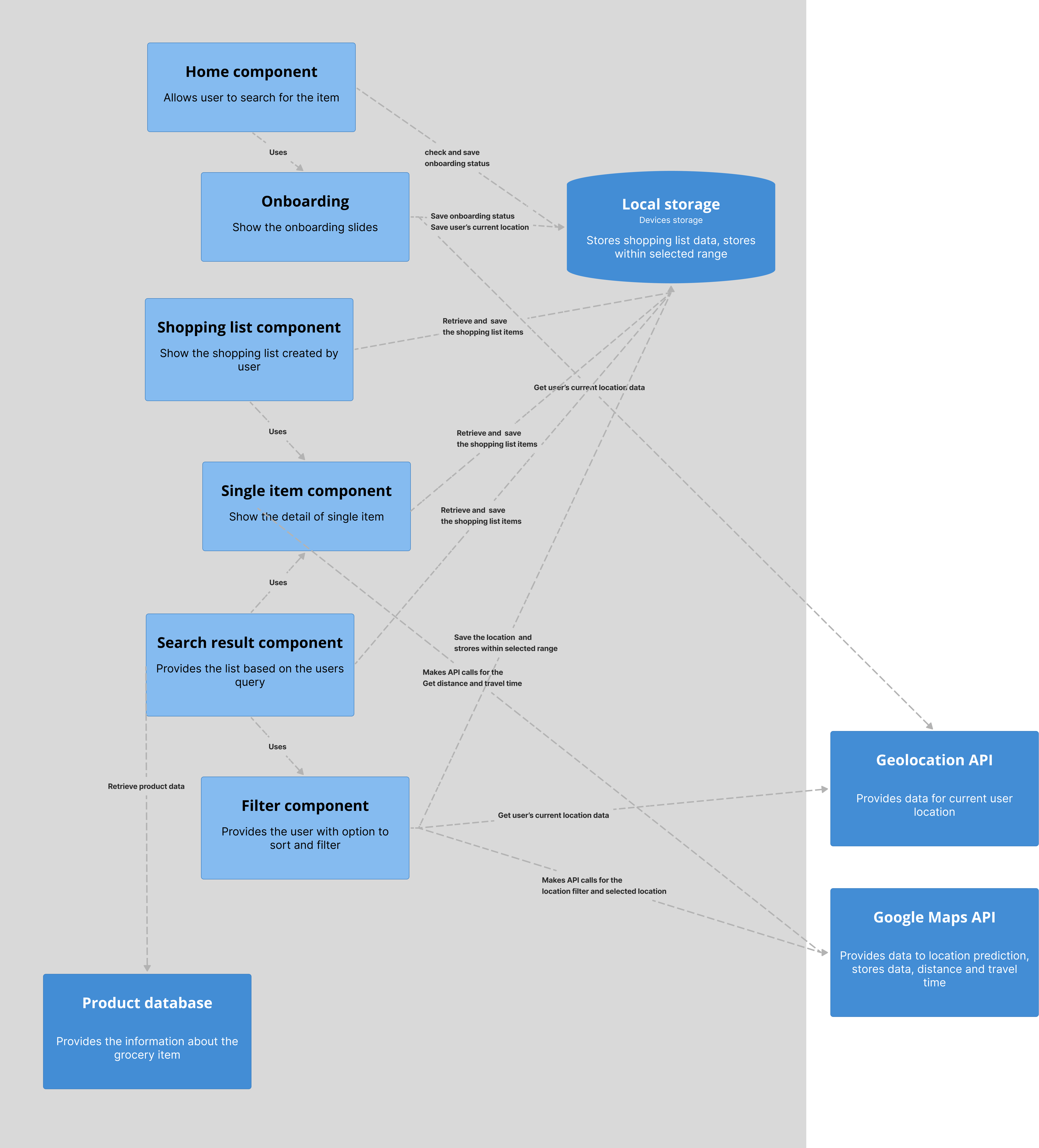
I built the front-end in Ionic Angular and Bootstrap, alongside an in-house back-end developer who built the Shopping Scraper API and the database. Owning the front-end myself meant no handoff gap. Every design decision landed in code as intended, and anything that looked good in Figma but was awkward to build got caught early enough to fix.
A few interactions got simplified during the build. The simpler version usually worked better for users anyway.
Two rounds of usability testing with five users each. Round one tested the core flows, and two findings shaped the next iteration: the search bar was too small for one-handed use on the bus, where most testers said they actually used grocery apps, and the navigation icons were not recognisable to first-time users unfamiliar with Dutch app conventions.
Round two tested the revised flows. The thumb-zone search header tested cleanly, and so did the navigation icons with text labels. The only new finding was small, some label wording and one error message, fixed before launch.
A heuristic evaluation by an external designer, done after round two, brought a different lens: consistency, terminology, error handling, and accessibility compliance. It found one thing the usability testing had not: the original add-to-list button looked like a paste button, and the error message wording was technical in two places.
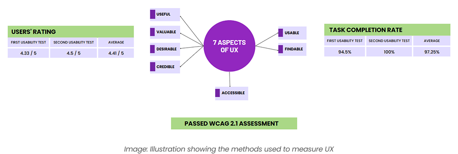
After launch, a survey of 45 users structured around Peter Morville's UX Honeycomb (useful, usable, findable, credible, desirable, accessible, valuable) put the strongest scores on usable and findable, the two dimensions the design had focused on most. The weakest was desirable: the app was useful but not loved, and the onboarding step scored lowest.
Owning both design and front-end changed how I approached the UX work. Knowing I would build it made me more careful about decisions that would be hard to implement. That constraint improved some of the solutions. Things that looked elegant in Figma got simplified once I built them, and the simpler version almost always worked better for users.
I did ten interviews with newly arrived expats in the Netherlands. The market gap was easy to describe but hard to specify, so the interviews were meant to turn it into a list of features people would actually use, ranked by importance.
Six grocery comparison apps existed in the Netherlands at the time of the project. The market gap was specific: English support was completely absent across all six, and only one had any mobile experience worth calling that.
The MVP scope followed directly from this. Anything an existing app did well was treated as a baseline, and anything no existing app did was a candidate for the MVP. The five features chosen for the MVP were the five that none of the existing apps covered well.
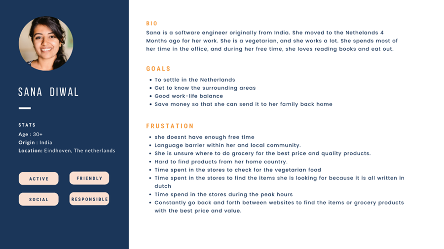
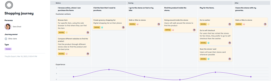
The interviews fed straight into a user persona and a user journey map. The persona captured shopping behaviour, constraints, and goals from the 10 participants. The journey map traced the steps an expat takes when buying groceries, with the frustrations at each stage.
Together they kept the design grounded in what people already did to cope, not what they wished existed.
Before drawing any screens, I mapped the full navigation structure in a UX flow chart. The app had to be simple enough for a first-time user to move through without instruction, especially someone unfamiliar with Dutch app conventions. That is harder to design for than it sounds across multiple languages and user contexts.
From the flow chart I moved into sketches, then Figma prototypes, testing and iterating between rounds. The goal was to settle every open design question before development started, so nothing needed rethinking halfway through a build.
Two rounds of usability testing with five users each. Round one tested the core flows, and two findings shaped the next iteration: the search bar was too small for one-handed use on the bus, where most testers said they actually used grocery apps, and the navigation icons were not recognisable to first-time users unfamiliar with Dutch app conventions.
Round two tested the revised flows. The thumb-zone search header tested cleanly, and so did the navigation icons with text labels. The only new finding was small, some label wording and one error message, fixed before launch.
A post-launch survey of 45 users structured around Peter Morville's UX Honeycomb spreads experience across seven dimensions: useful, usable, findable, credible, desirable, accessible, and valuable.
The strongest scores were on usable and findable, the two dimensions the design had focused on most. The weakest was desirable: the app was useful but not loved, and the onboarding step scored lowest, which is the next thing I would change.