Case study · Learning management system
Redesigning the teacher side of a B2B learning platform, where the real product complexity actually lived.
Hundreds of teachers across Dutch vocational schools were using this part of the platform every day. Most of them were also calling the helpdesk every week. The calls were rarely about bugs. They were about how to set up a variant, how to score a class with multiple cohort years in it, and how to manage student progress across overlapping groups.
The student-side redesign had been the visible part of the project. The teacher side was where the real product complexity lived, and where this case study focuses.
"The teacher had a printed cheat sheet on her desk for which menu they need to open to switch between managing student variants and actually open the course item for teaching."
from a contextual inquiry sessionThe research methods here were chosen specifically to make the complexity visible: watching teachers in real classrooms, tracking a full term, and putting numbers on cognitive load before testing the redesign. Open any method for the full detail.
Understanding context
Measuring the problem
Testing the redesign
The team's first instinct was a default author variant with filters on top. But teachers were not filtering content, they were restructuring it. Vocational classes hold students from multiple cohort years on different curriculum versions, and teachers were already building workarounds to handle it. We shipped a teacher-editable variant tree with drag-and-drop reordering, bulk operations, and per-variant scoring. The system started supporting their work instead of working against it.
The cleaner data model would have been one scoring scale per course, and two senior developers argued for it. But teachers had been creating duplicate courses for years to get around the single-scale limit. We put scoring inside the variant instead. We were not adding complexity, we were showing complexity that already existed. The diary-study data changed the developers' minds, not the design argument.

Before, grading, messaging, planning, exam access, and attachments lived on separate screens, consistent with the data model but not with how teachers worked. Teachers were not thinking "now I am doing the messaging task." They were thinking "now I am dealing with this student." We consolidated everything onto one progress page anchored on the student, not the task type.
The student-side wins were visible within weeks. The teacher-side wins took a full term, because that's the timescale on which teachers actually use the product.
I categorised six months of helpdesk tickets by hand, which took about a week of focused work. A simple keyword tagger would have done the same job in a day, and it would have been reusable for the next analysis.
Hundreds of teachers across Dutch vocational schools were using this part of the platform every day. Most of them were also calling the helpdesk every week. The calls were rarely about bugs. They were about how to set up a variant, how to score a class with multiple cohort years in it, and how to manage student progress across overlapping groups.
The student-side redesign had been the visible part of the project. The teacher side was where the real product complexity lived, and where this case study focuses.
"The teacher had a printed cheat sheet on her desk for which menu they need to open to switch between managing student variants and actually open the course item for teaching."
from a contextual inquiry sessionI started with contextual inquiry at two schools, sitting alongside teachers during normal lesson preparation, grading, and class management.
The most useful pattern was a list of workarounds I had not expected: teachers exporting their progress data to spreadsheets because the in-platform view was missing columns they needed, teachers creating duplicate courses to handle a scoring scale that did not fit the official one, and teachers using sticky notes on their screens to track which students were in which cohort year.
Six teachers kept lightweight daily entries for a full term. A two-week usability test would have caught one slice of vocational teaching. A full term caught all four phases, and each season stressed a different part of the system.
The issues that show up in week 12 are not the issues that show up in week 2, which is what a two-week usability test would have missed.
Variant setup, scoring domain, student assignments, the heavy build-out week. Where teachers used to need a cheat sheet open on the desk.
Daily teaching, grading, planning dates, where most teachers and students interacted heavily within the platform
Checking per-variant scoring domains, marking non-scoreable items, and granting exam access.
Grading "kwalificatie dossier", and exam commission reporting time, during this time of the term teachers need the platform support to provide reliable data.
Vocational education structure (MBO BBL and BOL) is genuinely complex. A class can have students from several cohort years following different curriculum versions. One course can be taught with three different scoring scales and calculations, depending on the school's policy. A variant tree can hold items that some students see and others do not. None of this is the product's fault. It is the reality of the domain.
So the design problem was not to remove complexity, but to give teachers a usable, flexible system that fits their complex workflow.
I worked through the teacher tasks alone, scoring each one on cognitive load, decisions required, and screens visited. Adding this to the contextual inquiry was triangulation: teachers reported finding student progress tracking "it's okay", but the walkthrough showed it took four separate screens for what one progress table could show. The two most-visited tasks had the worst complexity scores.
Same task on both systems. Three load dimensions, before and after.
Why this mattered. The "before" load sat above Miller's 7±2 ceiling for short-term memory. That's not a UX opinion, it's the working-memory limit that explains why teachers kept printed cheat sheets on their desks. Each design decision in the redesign was scored against the same three dimensions, and only shipped if it lowered at least one without raising the others.
These are the three pieces of the redesign I am most proud of, and the ones that took longest to get right.
The team's first instinct was a default author variant with filters on top. But teachers were not filtering content, they were restructuring it. Vocational classes hold students from multiple cohort years on different curriculum versions, and teachers were already building workarounds to handle it. We shipped a teacher-editable variant tree with drag-and-drop reordering, bulk operations, and per-variant scoring. The system started supporting their work instead of working against it.
The cleaner data model would have been one scoring scale per course, and two senior developers argued for it. But teachers had been creating duplicate courses for years to get around the single-scale limit. We put scoring inside the variant instead. We were not adding complexity, we were showing complexity that already existed. The diary-study data changed the developers' minds, not the design argument.
Before, grading, messaging, planning, exam access, and attachments lived on separate screens, consistent with the data model but not with how teachers worked. Teachers were not thinking "now I am doing the messaging task." They were thinking "now I am dealing with this student." We consolidated everything onto one progress page anchored on the student, not the task type.
Two waves of testing, plus post-launch monitoring.
I tested clickable Figma prototypes with five teachers from across the three personas, working through realistic task scenarios and thinking aloud. The variant tree got the strongest reaction: teachers wanted to add their own materials inside it, not just rearrange what was already there.
Helpdesk tickets are an unfiltered view of where a product fails in production. I categorised six months of tickets by topic and frequency, to ground the design decisions in volume, not just observed patterns. The three biggest categories, variant setup, scoring configuration, and student progress retrieval, matched the three design decisions in the final design.
Analysing the test results to create a better product. Sample findings and iteration:
The student variant switcher was available, but participants missed it.
The test showed that teachers always start the school year by creating a new group, so I made it possible to check and switch a student's variant directly from the group page.
I categorised six months of helpdesk tickets by hand, which took about a week of focused work. A simple keyword tagger would have done the same job in a day, and it would have been reusable for the next analysis.
I started with contextual inquiry at two schools, sitting alongside teachers during normal lesson preparation, grading, and class management.
The most useful pattern was a list of workarounds I had not expected: teachers exporting their progress data to spreadsheets because the in-platform view was missing columns they needed, teachers creating duplicate courses to handle a scoring scale that did not fit the official one, and teachers using sticky notes on their screens to track which students were in which cohort year.
The duplicate-course workaround was the most telling. Teachers had been building the same course twice, once per cohort year, because the system could not hold two scoring scales under one course. It had been running for years.
Six teachers kept lightweight daily entries for a full term. A two-week usability test would have caught one slice of vocational teaching. A full term caught all four phases, and each season stressed a different part of the system.
Variant setup spiked for two weeks at term start. Progress tracking and messaging dominated mid-term. Scoring configuration became critical pre-exam. Report generation, grading exports, and student transitions clustered at term end.
Vocational education structure (MBO BBL and BOL) is genuinely complex. A class can have students from several cohort years following different curriculum versions. One course can be taught with three different scoring scales and calculations, depending on the school's policy. A variant tree can hold items that some students see and others do not. None of this is the product's fault. It is the reality of the domain.
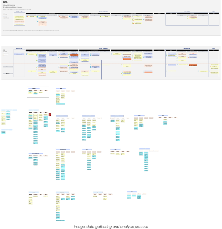
So the design problem was not to remove complexity, but to give teachers a usable, flexible system that fits their complex workflow. I mapped the gap between the teacher's mental model and the system's model to keep that distinction in view throughout the redesign.
I worked through the teacher tasks alone, scoring each one on cognitive load, decisions required, and screens visited. Adding this to the contextual inquiry was triangulation: teachers reported finding student progress tracking "it's okay", but the walkthrough showed it took four separate screens for what one progress table could show. The two most-visited tasks had the worst complexity scores.
I tested clickable Figma prototypes with five teachers from across the three personas, working through realistic task scenarios and thinking aloud. The variant tree got the strongest reaction: teachers wanted to add their own materials inside it, not just rearrange what was already there.
Helpdesk tickets are an unfiltered view of where a product fails in production. I categorised six months of tickets by topic and frequency, to ground the design decisions in volume, not just observed patterns. The three biggest categories, variant setup, scoring configuration, and student progress retrieval, matched the three design decisions.
After launch, variant setup tickets dropped from 167 per term to 31.