Moodlet stress tracker
Making room for the person behind the data.
The Moodmetric ring could show a change in physical arousal. It couldn’t tell us what had happened, or how the person felt about it. Moodlet brought those readings together with a personal journal.
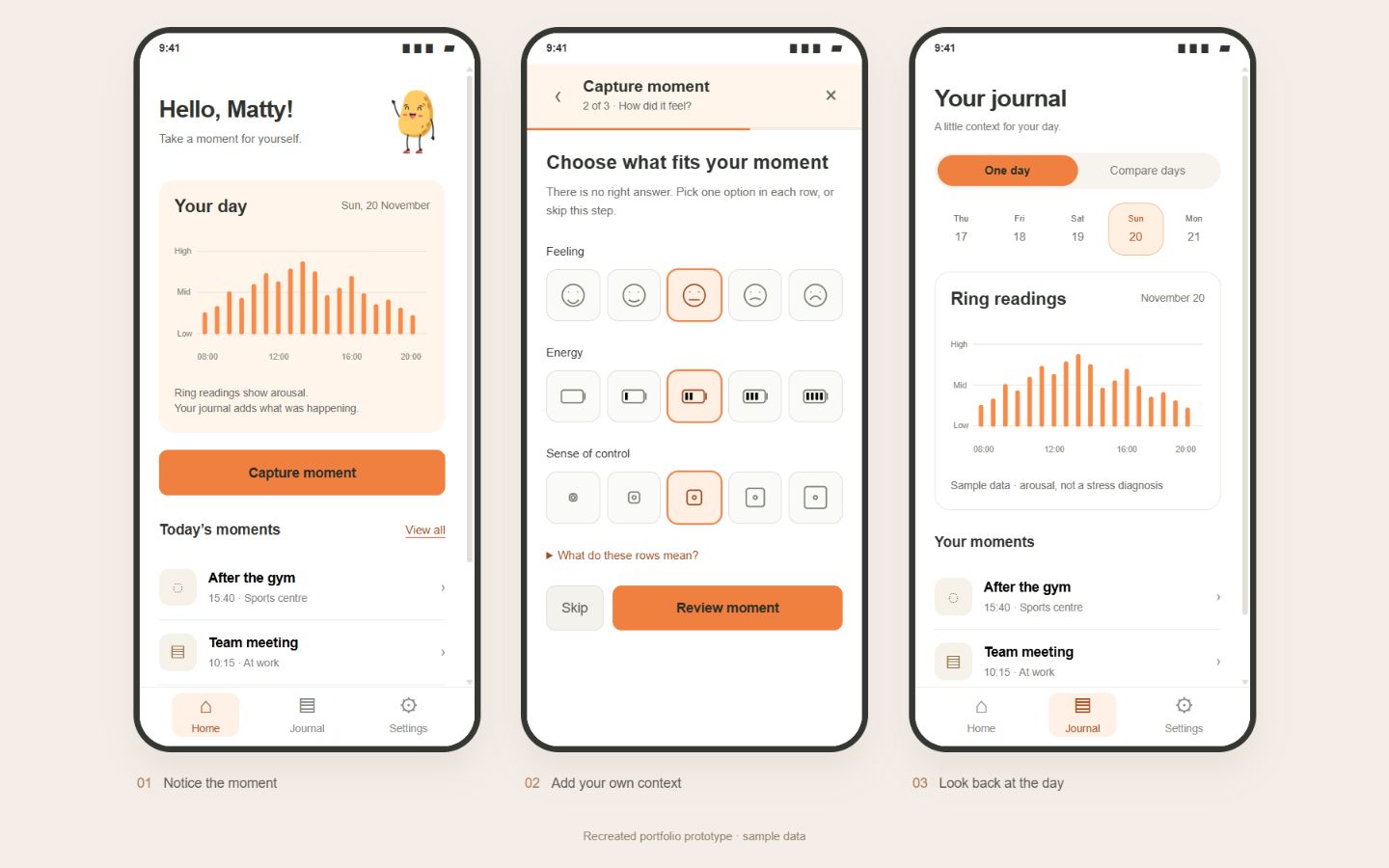
A reading needs context
This was a stress-coaching research project for people with Autism Spectrum Disorder. The challenge was to help someone look back at their day without making the act of tracking feel like another demanding task.
A higher reading might appear during a difficult meeting or after exercise. The graph alone wasn’t enough to explain the difference. I wanted the journal to make it easy to add that missing context, at the user’s own pace.
What the research needed to answer
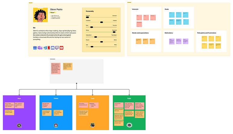
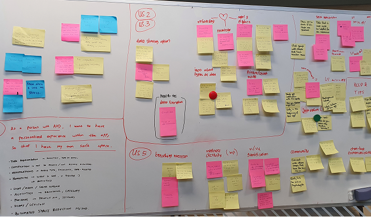
I used a persona and empathy map to think through moments in the day, then turned those needs into user stories and requirements. The questions were practical: can I understand the data, explain a moment, know what is being collected, and adjust the app to suit me?
We also reviewed direct and indirect competitors, including Samsung Health, Apple Health and Productive. That helped us compare ways of presenting tracking data and daily activities. The design still needed to fit this project’s users, rather than reproduce another dashboard.
Three pages, each with a clear job
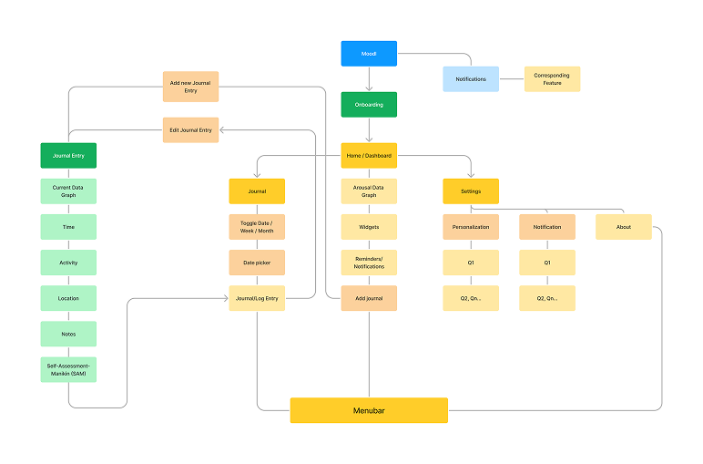
I organised the app into Home, Journal and Settings. Home offered a quick view of the day and a way to capture a moment. The journal connected entries to a date. Settings kept personal preferences and data controls in one place.
I discussed early sketches with colleagues before building the Figma prototype. Keeping the main navigation small gave us a way to organise the features without asking users to learn a larger app.
Explain data before asking for it
The onboarding explained what the ring collects, why the data matters and how it is handled. I wanted those explanations to be part of getting started, not something the user had to search for afterwards.
Let the person describe the moment
Capture Moment asked what happened, where it happened and how the person felt. The entry gave the reading a personal account alongside it, rather than treating the number as the whole story.
Keep the first view simple
The home graph focused on one day. More detailed reflection belonged in the journal, so the opening screen didn’t need to explain every pattern at once.
Give control over interruptions
We removed most push notifications and made the remaining ones configurable. A reminder should be something the user chooses, especially in an app intended to help them notice and manage stress.
What changed after testing
We held three interviews with people from the target group and asked them to complete tasks in the prototype. Recruitment limited the sample to three. The sessions gave us specific problems to work on, but couldn’t tell us whether the app would help people manage stress over time.
Looking beyond a single day
Participants wanted to look for patterns across days. I added a comparison chart so they could place two days beside each other.
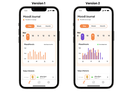
Removing confusing emotion labels
The labels around the Self-Assessment Manikin (SAM) choices caused confusion. I simplified the labels and added an information layer to explain the choices when needed.
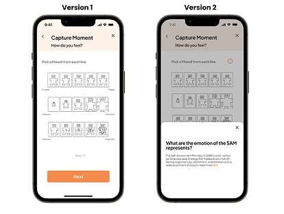
The recreated screens at the top show the overall flow. The images here are the original project artefacts behind these changes.
What I took from the project
Moodlet taught me to separate what a device can measure from what a person can explain. Giving both a place in the interface was more useful than adding more detail to the graph.
The project ended with a high-fidelity prototype. A useful next step would be a longer study with a broader group of users: do people keep adding moments, can they interpret comparisons, and do the reminders remain helpful after the novelty wears off?