Teacher Portal
Redesigning the teacher experience
The outcome
I compared six months of helpdesk calls before and after the redesign, focusing on calls tagged to the three redesigned workflows.
These figures represent a subset of the 50–70 teacher-related calls received per month. The overall call volume remained high, but fewer calls were related to the three workflows we redesigned.
Dictionary
- Curriculum
- The learning programme for an MBO study, based on its qualification requirements.
- Cohort
- A group of students who start the same curriculum in the same academic year.
- Variant
- The structure and configuration of a curriculum for a specific cohort. Different cohorts can use different variants of the same curriculum.
- Scoring domain
- The scoring scale and rules used to assess student performance.
The problem
LearningBox is a learning platform used by Dutch vocational schools.
Teachers often struggled with:
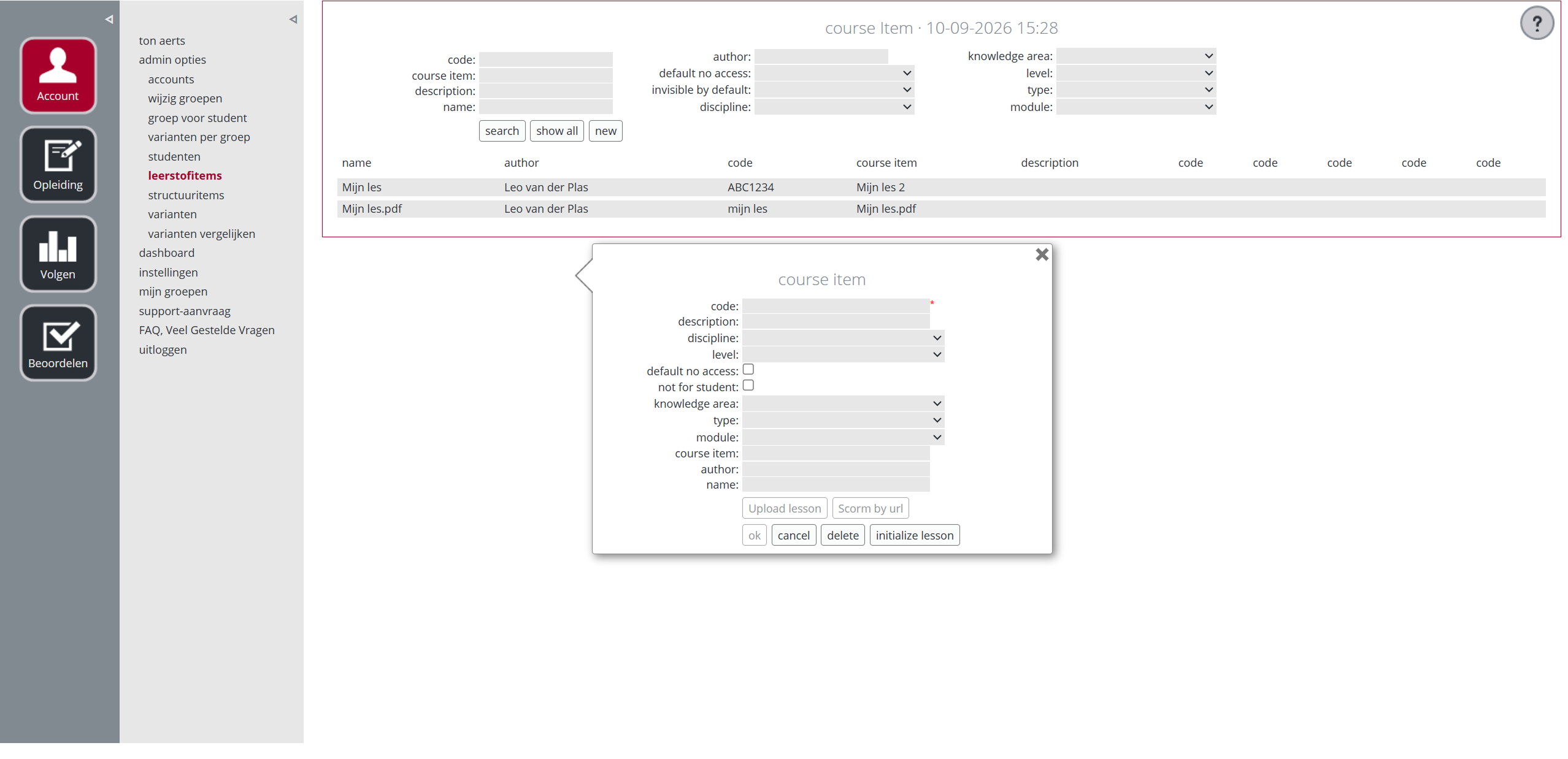
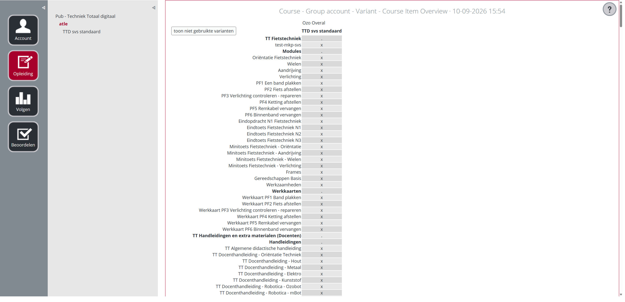
- setting up course variants for different cohorts
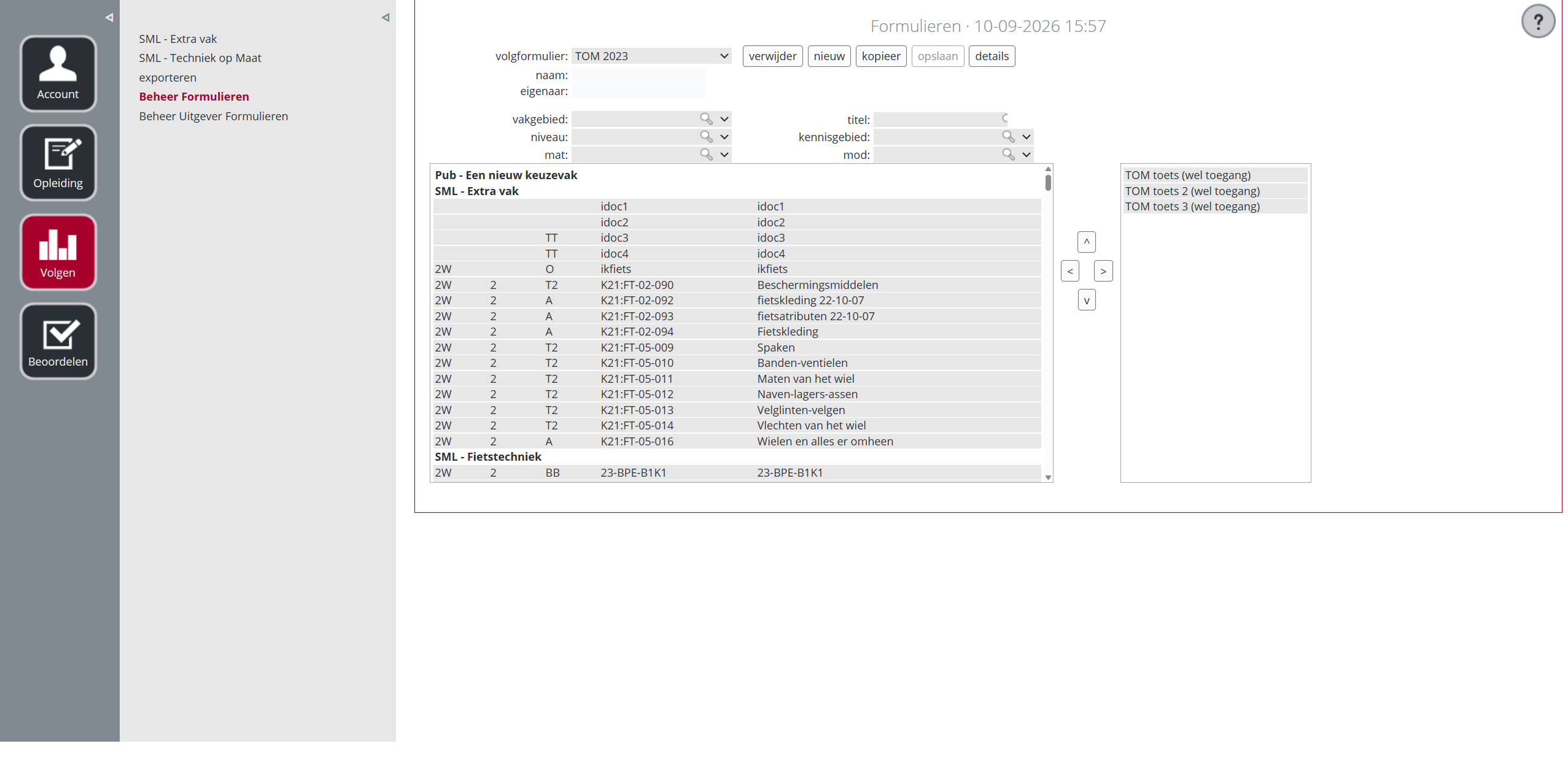
- scoring students across cohorts
- finding student progress across groups and screens
So the question was:
Was the problem caused by the UX architecture, or was the system flow simply too strict for the way teachers actually worked?
Research
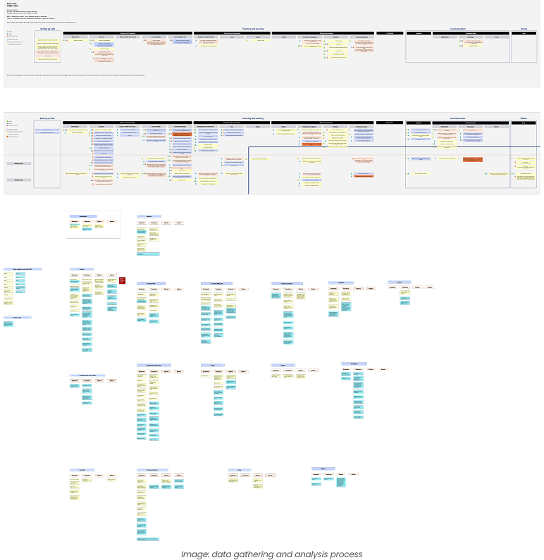
I observed teachers at two schools setting up courses, grading students and checking progress.
Their workarounds showed where the product was falling short:
- spreadsheets for tracking students across cohorts
- sticky notes for cohort and curriculum versions
- duplicate courses when cohorts needed different scoring
Short usability tests would only show part of the problem, so I ran a diary study with four teachers at different points in the academic year.
- Weeks 1–2Course setup and scoring
- Weeks 3–8Grading and planning
- Weeks 9–11Exams and scoring
- Week 12Reporting and qualification
This exposed problems that would otherwise have been missed. Reporting issues, for example, only appeared near the end of the academic year.
Measuring the complexity
The complexity was real.
A class could contain students from different cohorts, each following a different variant of the same curriculum. Different variants could also require different scoring scales.
The problem was how much of this complexity teachers had to manage themselves.
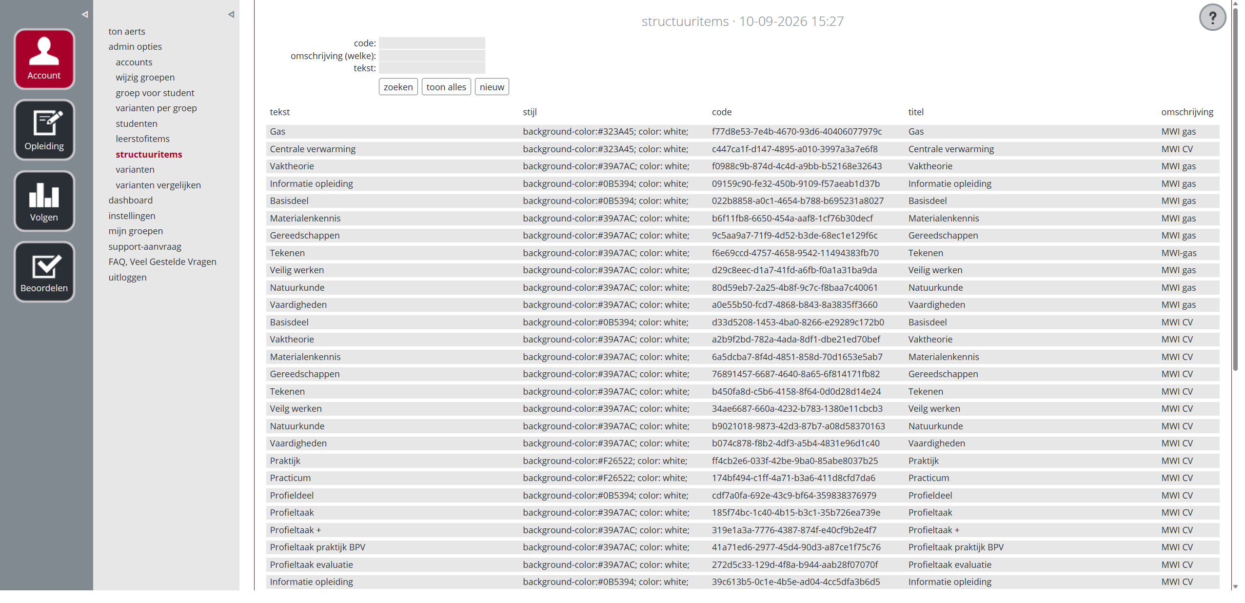
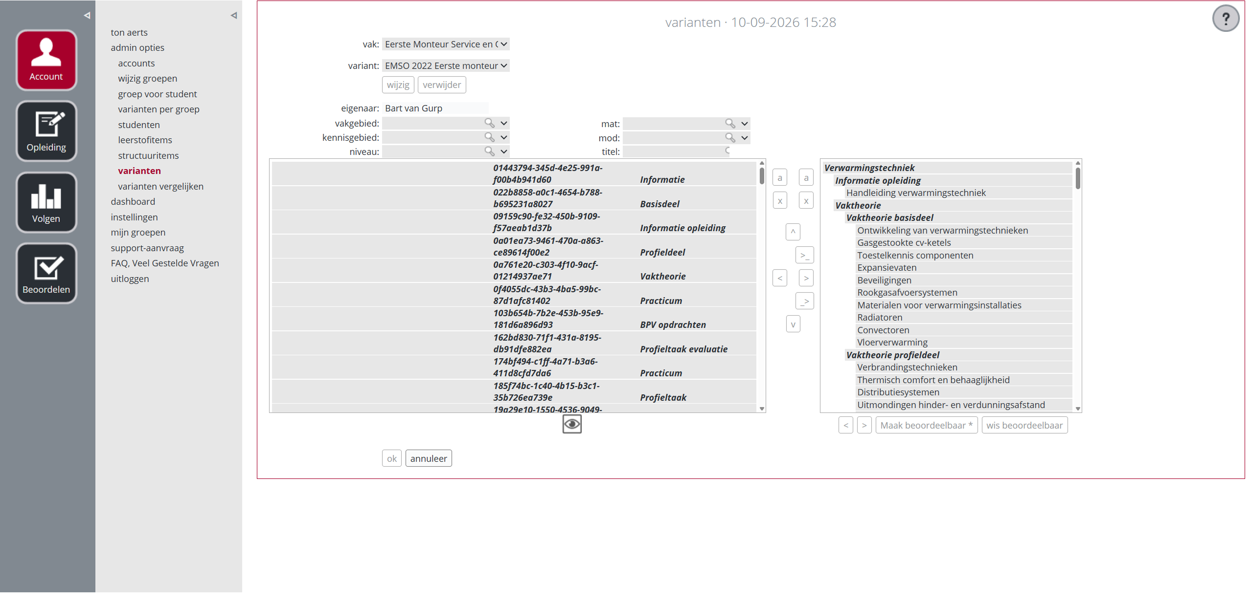
I created a task-complexity matrix. For each task, I measured the number of decisions, screens and pieces of information teachers had to manage.
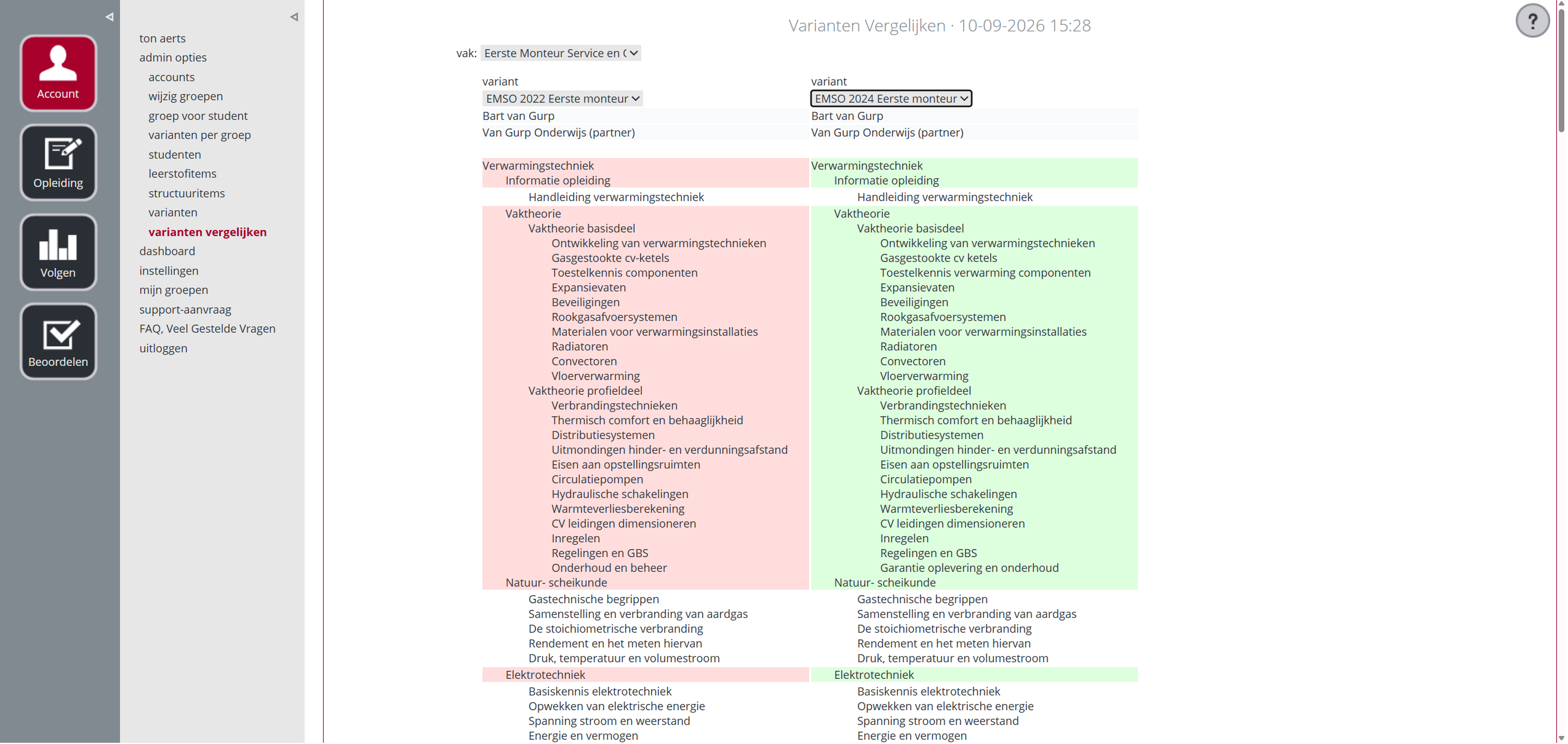
Variant setup
- Decisions
- 14
- Screens
- 7
Progress tracking
- Decisions
- 11
- Screens
- 5
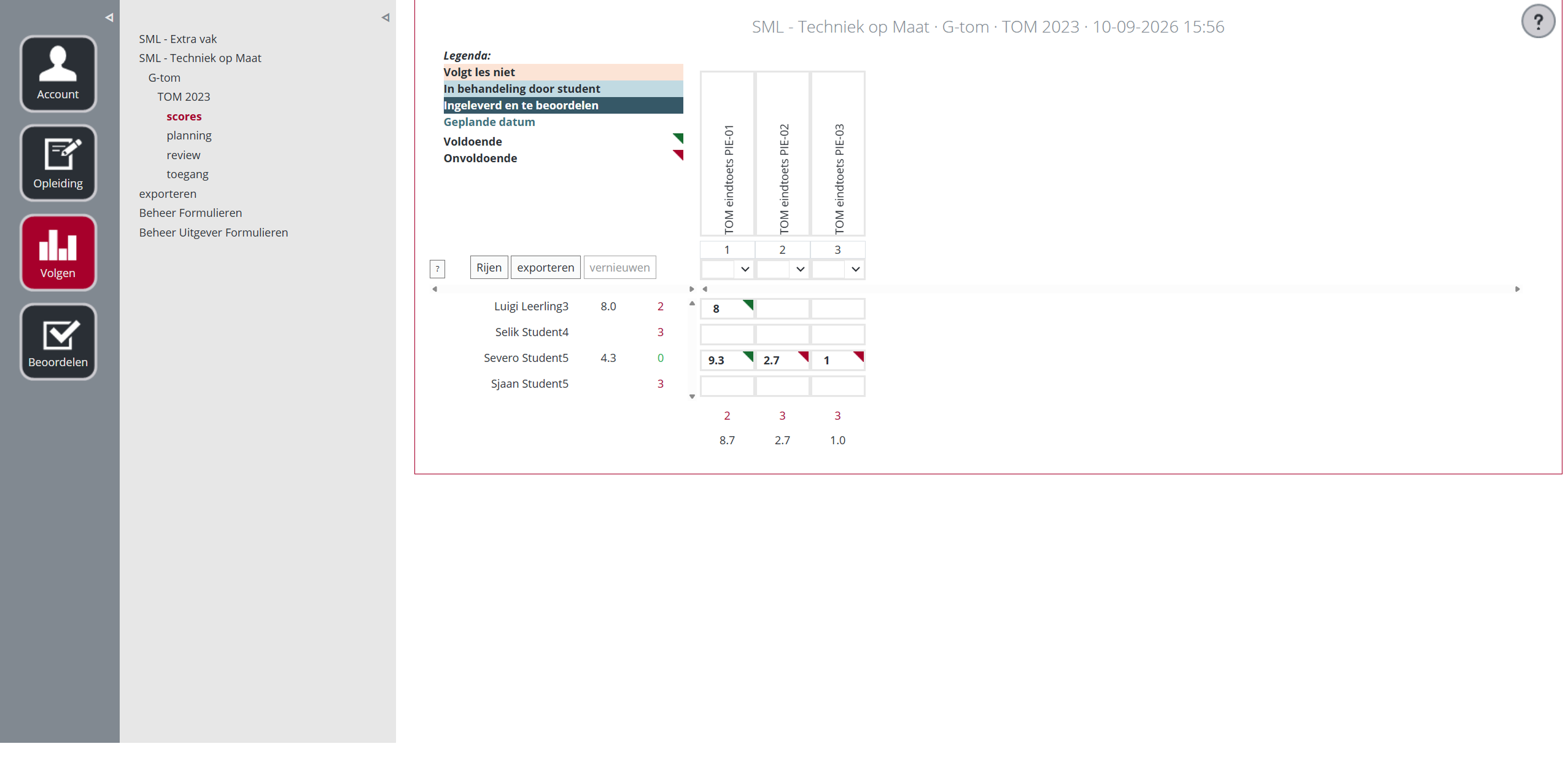
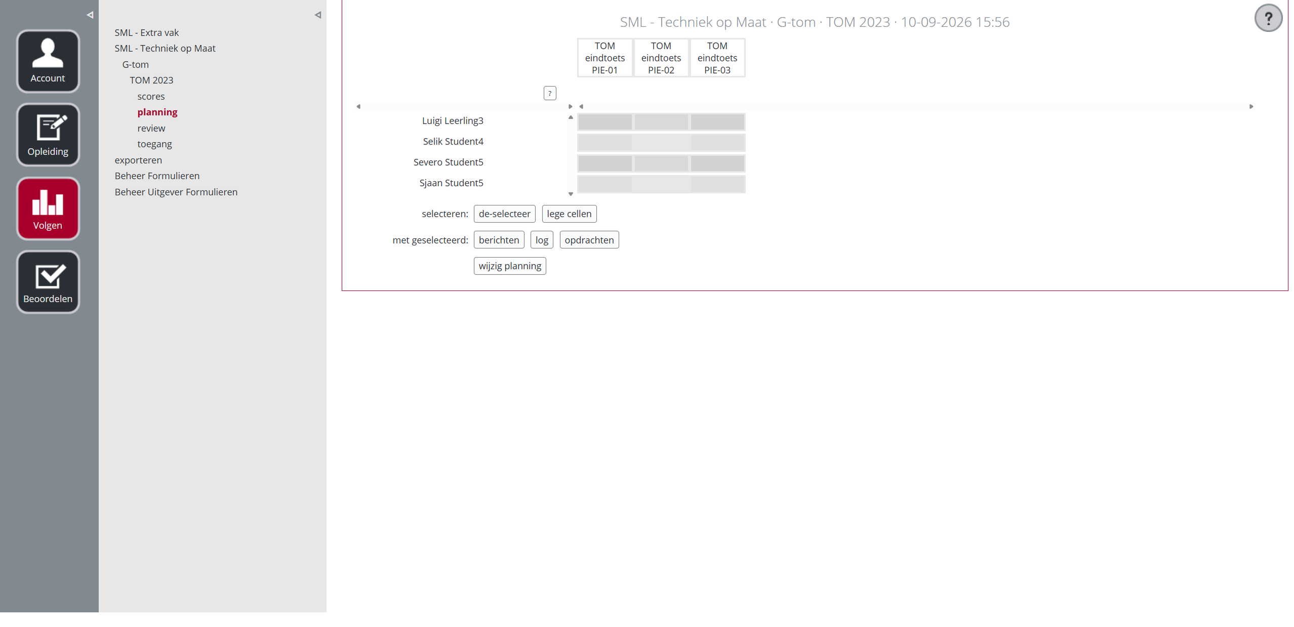
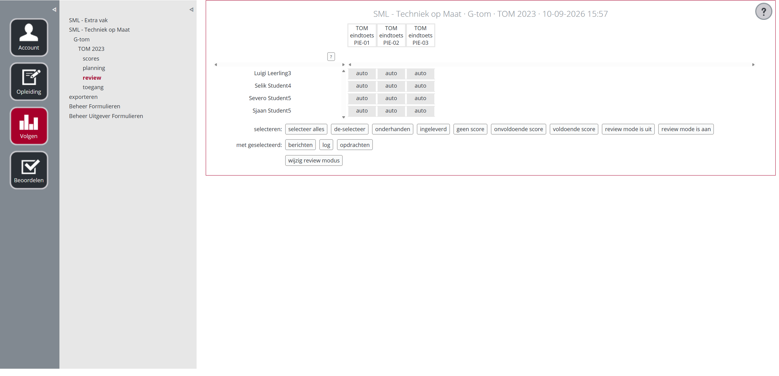
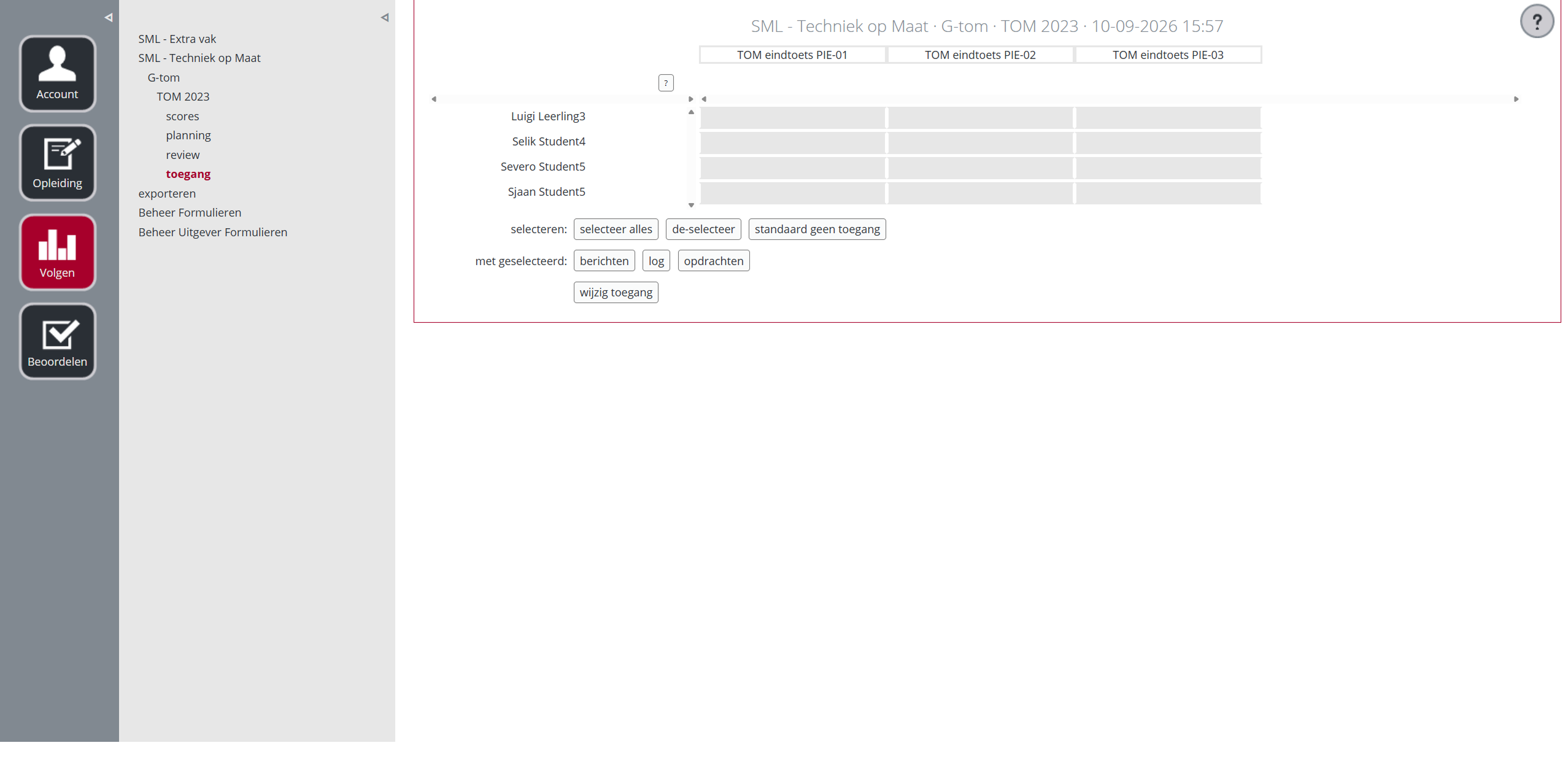
Variant setup and progress tracking had the highest complexity. I used these measures to compare design options instead of judging concepts only by visual simplicity.
Redesign
Let teachers structure variants
The team's first idea was one default author variant with filters.
The filter was easier to build, but the research showed that teachers weren’t simply filtering content. They were restructuring the curriculum for different cohorts.
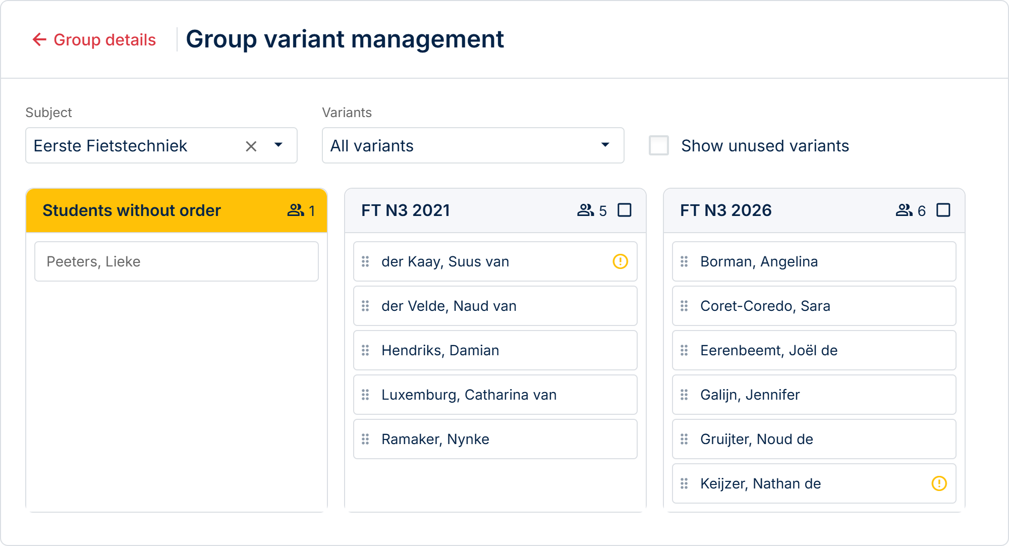
The final direction was a teacher-editable variant tree with drag-and-drop, bulk actions and per-variant configuration.
Move scoring into the variant
Moving the scoring domain into the variant was technically complex, but it gave teachers the flexibility they needed.
Each variant could now have its own scoring setup, allowing different cohorts to use different scoring scales within the same curriculum.
Bring student progress together
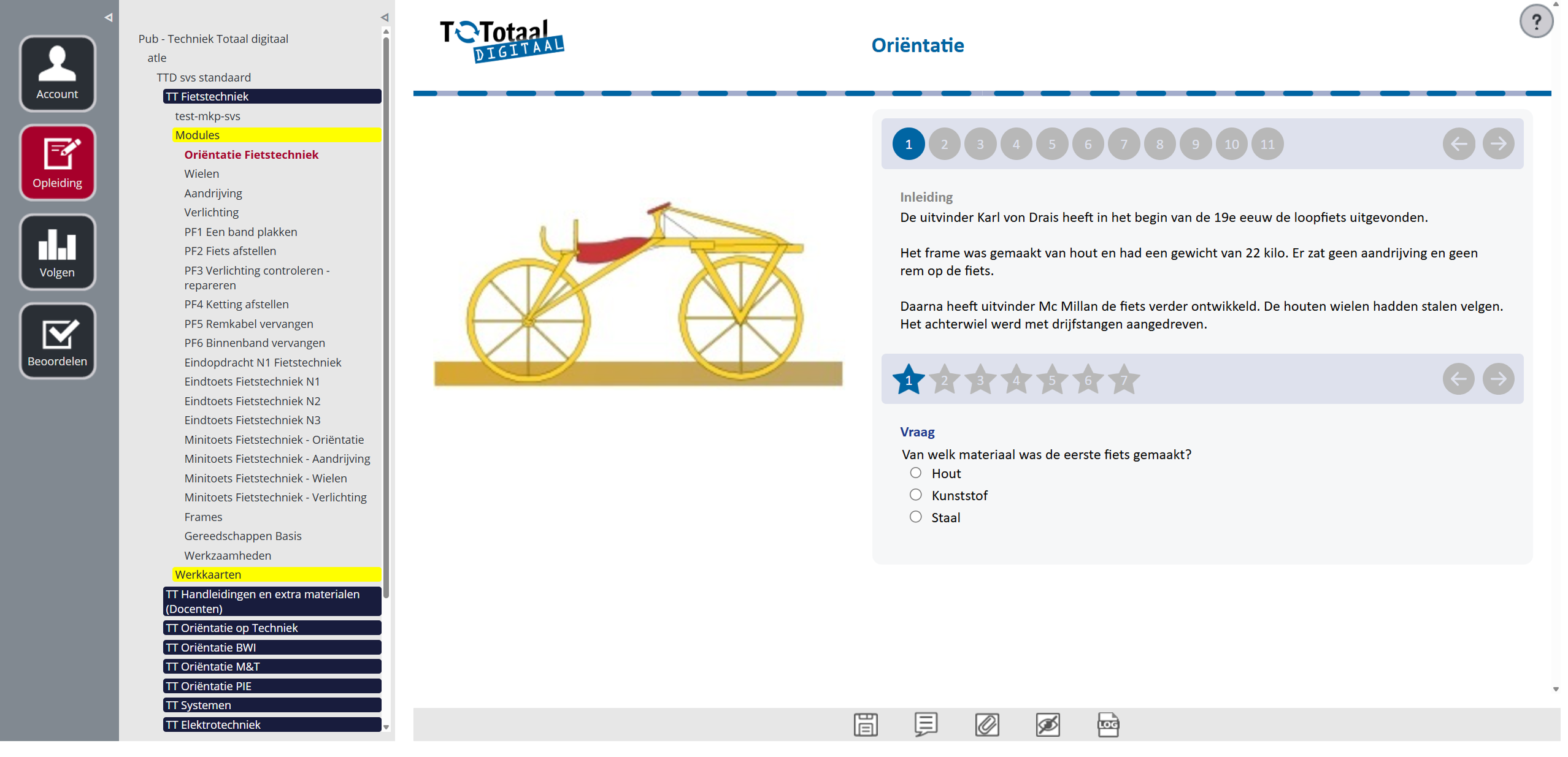
Grading, messaging, planning, exam access and attachments were spread across multiple screens.
I first explored improving navigation between these screens. It helped, but teachers still struggled with classes containing students from different cohorts.
The final design brought the relevant information and actions into one progress page.
Testing
I tested the direction with five teachers using realistic scenarios.
The variant tree was the strongest concept. Teachers also wanted to add their own materials directly, so we added this to the first release.
The test was intentionally small. The goal was to validate the interaction and direction, not to claim statistical usability results.
After launch, another issue surfaced.
Teachers started from the group page, but the variant switcher was located near the variant management page. Many teachers never saw it.
We added the switcher to the group page based on actual usage.
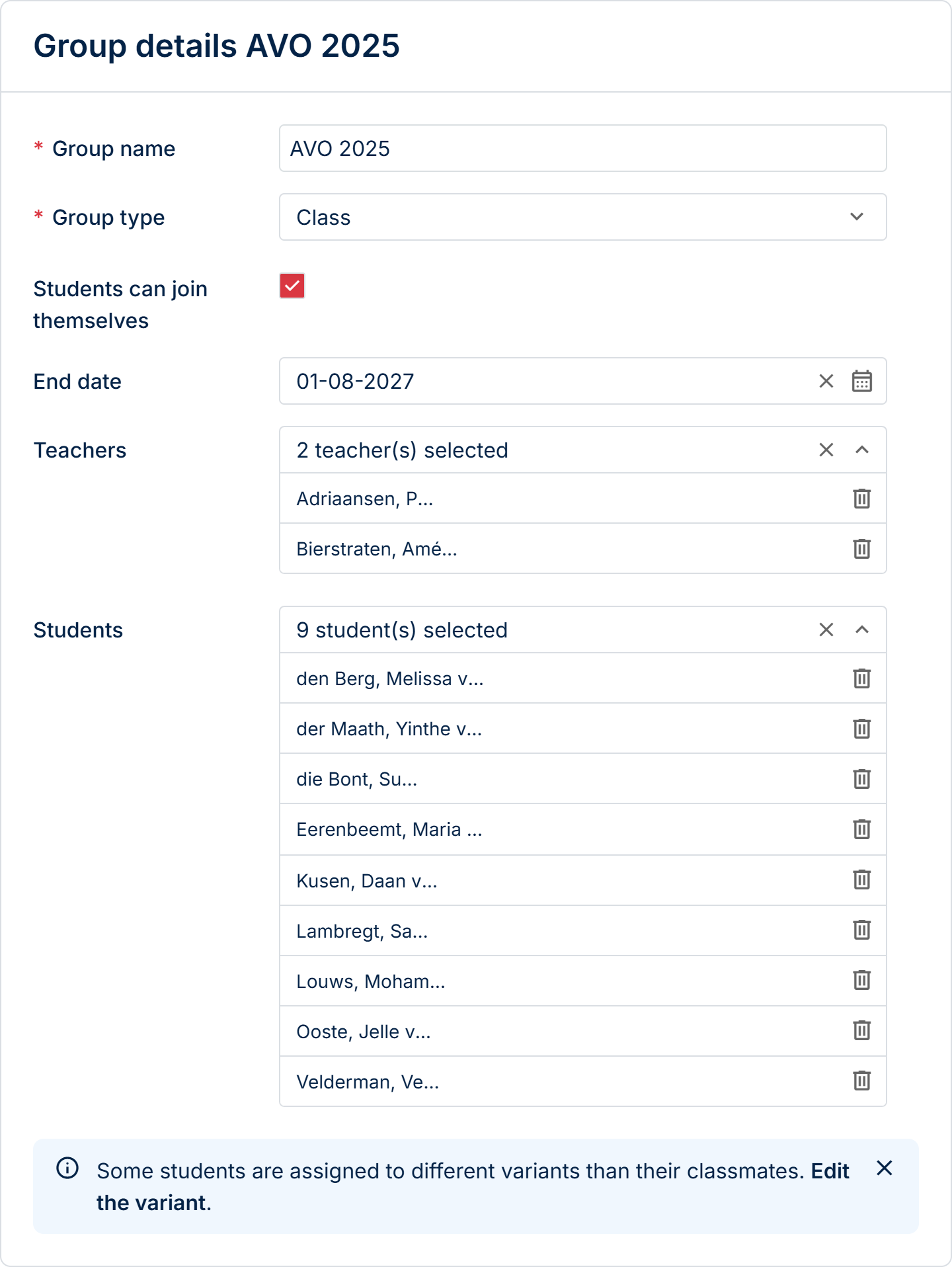
We continue to monitor the results, but the early trend suggests that teachers are becoming more confident handling these tasks themselves.
Reflection
This redesign was not only about changing the look and feel of the application. It changed the workflow itself and how teachers worked inside the platform.
That made adoption harder. Some teachers had developed their own ways of working around the old system, and even a better workflow required them to change familiar habits.
It taught me that redesigning an established product is not only a UX problem. You also have to design the transition from the old way of working to the new one.
If I continued this work, I would focus more on that transition: introducing changes gradually, providing clearer guidance in context and measuring where teachers still fall back into old workflows.